


Over the last 15 years of designing for real estate, I’ve seen it all… From outdated headshots to horribly constructed artwork to offensive language. But in this new age of DIY design (thank you very much, Canva), I can say the biggest mistakes are not the obvious ones anymore but instead the ones you might not even be aware of. As someone who’s on Instagram every day and who follows quite a big chunk of realtors, I get to see a lot of real estate posts – and a lot of design mistakes on those posts. So today, I’m going to break down the three post mistakes you need to stop making … right now.
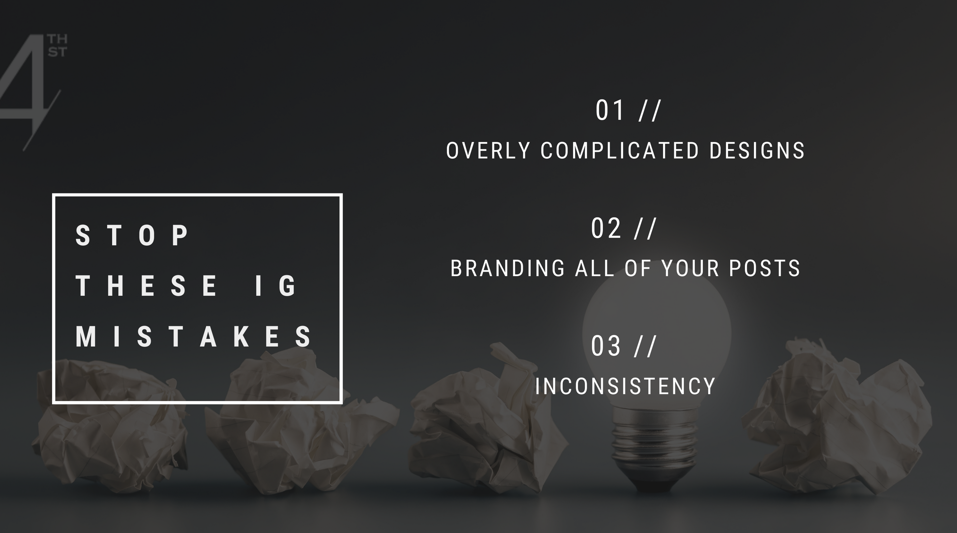
NUMBER ONE | BUSY DESIGNS
I know that it can be very tempting to advertise all of your solds in one post or put a bunch of property photos in a “just sold” post. I get it: You want to deliver the goods all at once so your audience knows what a superstar realtor you are. But here’s the thing: Instagram is a visual platform, so we want to engage people visually Sometimes, when you create busy designs, it actually does the opposite (GASP!). Your audience sees clutter instead of information or noise instead of super stellar selling skills. When you add too many photos or too much text or too many design elements, you run the risk of frustrating your audience, coming across as salesy, or, even worse, unprofessional. I often see posts with paragraphs of content directly on the artwork. When there’s too much info delivered right away, people will generally scroll on by. The purpose of your post should be to stop the scroll and invite them into the rest of the story, whether that’s with your copy or a carousel post that directs them to relevant content.
NUMBER TWO | BRANDING EVERY POST
Boo, we know you’re a realtor. We do not need to see it on every single post. When you brand every post with a logo or your headshot, you come across as selling something. And, let’s be honest, most people aren’t on Instagram to be sold to. Instead, you want to invite them into stories, mix in some personal content, and lead with added value and authenticity. If every post is a sales pitch, you’re missing valuable opportunities to connect with your audience. Try keeping the tone of your posts consistent so your audience will start to recognize your style. This helps maintain brand consistency without looking like you’re constantly in sell mode.
NUMBER THREE | INCONSISTENCY
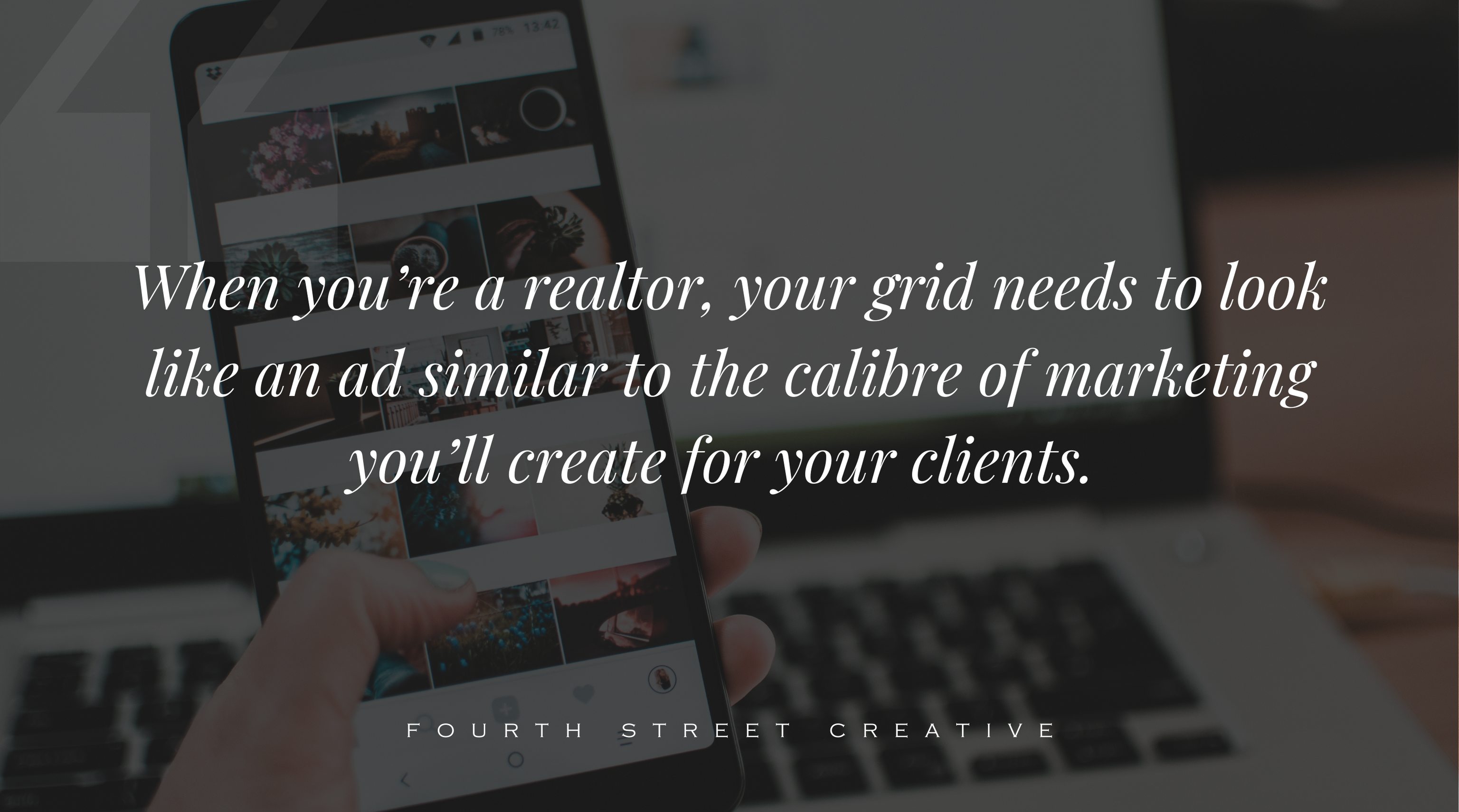
If your grid is currently a bunch of different Canva templates that have no distinct style, you’re not creating a professional portfolio for your potential clients to be dazzled by. I completely understand the urge to play around with all the templates and styles Canva (and beyond!) have to offer. BUT. When you’re a realtor, your grid needs to look like an ad similar to the calibre of marketing you’ll create for your clients. So instead, pick a few templates, use your brand colours and fonts in every single one, and get comfortable using images that are on brand for you.
If you’re not sure how to do this or don’t know where to start, head over HERE to my Insta-style quiz that will sort you into one of Fourth Street Creative’s six brand styles!