Colour is the first thing most of us notice about a brand. It can attract or repel us, cause us to buy or pass, like or dislike. We live in a colourful world, filled with thousands upon thousands of colour options, it’s great, and wonderous and beautiful until it comes time to choose one for your brand. Colour is often the trickiest component of brand creation and can be downright frustrating (I mean really how many shades of blue can there possibly be?). If you’re trying to develop a colour palette for your brand but feel like you keep hitting a wall, over and over (and over) again, read on, I’ve outlined the exact steps I follow with my clients when we are choosing and defining their brand colours.
one | COLOUR THEORY
Yup, there’s meaning behind your favourite colours, and it’s important to understand the psychology of colour and how it will make people feel when they are reviewing your marketing, websites and other brand assets before you start the colour choosing process.

Take a look at the colour guide above and pay attention to which colours you instantly gravitate towards, then ask yourself if you and/or your company resonate with the keywords associated with that colour. Sometimes are favourite colours are in direct opposition to our brand identity. Your favourite colour might be blue for example, but your brand is chic, classic and luxurious.
I always tell my clients that the colour theory step is more about eliminating what you don’t want rather than choosing a colour that works. At most you should have a few options that you are considering moving forward with but if you’ve just made the decision to remove one colour option from the group, you are exactly where you should be in the process.
two | INSPIRATION
As a Pinterest obsessed creative, I can spend hours upon hours getting lost in inspirational decor, colours and design. Pinterest is where I start this part of the design process with my clients. This is a great place to get the inspiration for your colour palette by hyper-focusing on what floats your boat or gives you tingles down your spine. Think of it like flipping through the pages of your favourite magazine and ripping out the pages that you love. Consider Pinterest your personal database of millions upon millions of magazines.
To start, head over to Pinterest, create a new board (if you don’t have an account what are you waiting for it’s free and so much fun) and start pinning anything and everything that sparks excitement in you. Pay little to no attention to colour at this point, just get to pinning things you love. Some ideas of where to start your search, and things I absolutely love to pin are home decor, favourite brands, clothing you love, design, art and photography. If you aren’t sure where to begin, I always recommend thinking of your absolute favourite store in the entire world (Restoration Hardware anyone?) and starting there. Once you’ve collected at least 20 pins, your job, for now, is done.
Psssst…Follow us on Pinterest for a constant stream of inspiration! Click Here
three | FOCUS
You’ve done the research now it’s time to start looking for trends, or commonalities between the images you’ve pinned. When I was developing our brand assets for Fourth Street Creative, there was a very clear direction my pins were leading me in, after a few weeks of pining I realized I gravitated towards dark tones, classic colours, vintage chic, a direction I didn’t expect my brand to go. So what trends do you see amongst your pins? Do you have a lot of light, neutral tones, do you have clean modern images? Or do you have a lot of pop and colour, vibrant energy with pinks, pastels, purples? If you feel there isn’t any common theme, try adding more images, or starting over completely and being brutally honest with yourself about how much you loved the images you originally pinned, sometimes we can fill our boards with images we feel so-so about instead of really waiting for those images that make our hearts sing and fingertips tingle. Keep going with this step until you can narrow down a common theme.
four | DEFINE
You’ve pinned your heart out and found a common colour theme, now it’s time to see where they fit in. When it comes to developing a cohesive colour palette I always like to define colours as seasons, this helps to better understand your preferred aesthetic and gives my clients some guidance and boundaries when it comes to putting it all together.
Take a look at the chart below and see where your colours fit in. Think of the energy of your colours, what your brand represents and the tones that you have chosen.
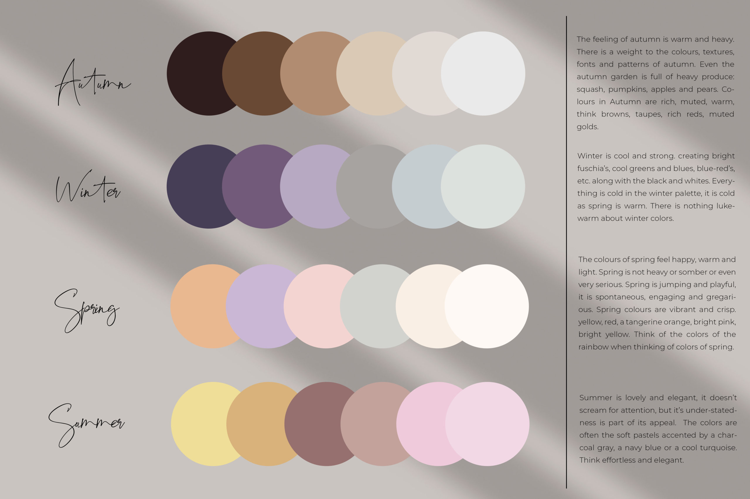
A great resource for seasonal palette inspiration I use all the time is design-seeds.com.
five | CHOOSE YOUR COLOURS
You’re almost at the finish line, the only thing left to do is to choose your 1-2 main colours and 1-3 neutral colours. Think of your main colours as the ones you will use most often, these are colours that will be most prominent (think headlines and important information). Then you will want 1-3 accent colours that compliment but don’t overpower your main colours. Take a peek at the example of our own brand colours below for inspiration.
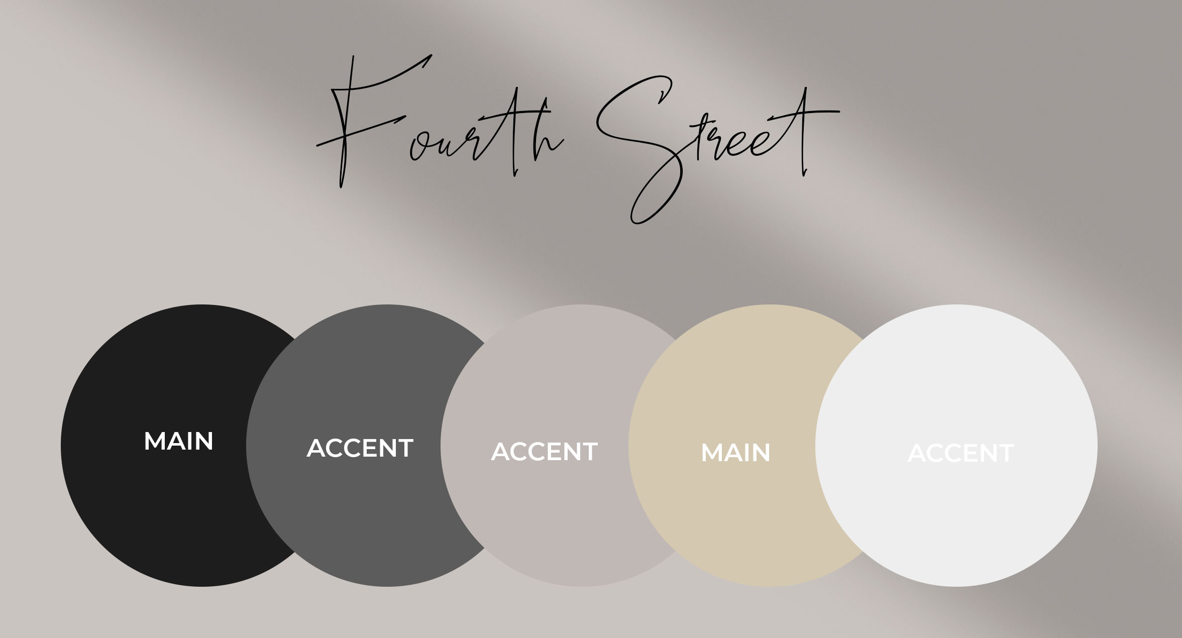
Head on over to image-color.com to grab colours from the images you’ve pinned on Pinterest. Or if you’re on your phone you can download the Palette Cam app which allows you to grab colour codes directly from the images on your phone. Make sure to jot these colour codes down somewhere easily accessible so you can have them ready to go any time you are putting together marketing materials. This is a great resource to hand over to your designer as well.
If you’ve come this far and are still not 100% on your brand palette, I urge you to take our Brand Style Quiz which will give you so much valuable information on your brand style, colours, typography and more. Take the QUIZ.
Once I narrowed down this process, my visual identity projects became much more streamlined. It’s amazing how much a project can be delayed due to something as seemingly silly as colour confusion, but, my friends, it’s a real problem affecting most design clients, and it’s also something that can be completely eliminated if you take the time to go through these steps.
