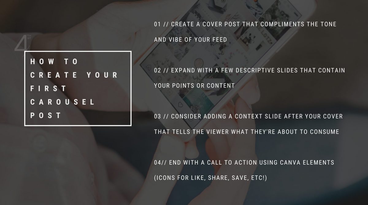
Your Instagram account is only as good as the amount of engagement it gets. You need engagement for your account to be found – by your existing clients and by potential ones! The carousel format works brilliantly for stats, tips, and other content that paints you as the expert in your field AND adds value for the viewer. This is the type of content your followers are most likely to save and share. Instagram favours carousel posts because it knows they result in more engagement – and you should too! This tutorial will show you just how easy it is to DIY your first carousel post for Instagram right in Canva.
ONE | CREATE A COVER POST
Open up Canva and start with a blank Instagram post-sized canvas (1080 x 1080 px). In our example, we’re creating a carousel post titled “Three Essential Staging Tips That Will Get Your Home Sold Fast” so we’ll head to “Photos” in the sidebar and type in “living room” to find a relevant photo. (Hint: one that looks staged, but not fake!) Fill the frame with your selected photo, then double click on the image to arrange it however you like within the image box. Next, hit “T” on your keyboard to bring up a text box and type in your post title. Change the font to your brand font or something that stands out (i.e., something bold!). Make sure it captures the viewer’s attention AND is easy to read. (None of those super swirly script fonts, please!) Finally, add your logo or some branding. This is a good idea for carousel posts especially because they’re more likely to be saved. When the viewer refers back to the post, they’ll immediately know the valuable content came from you!
Pro Tip: Use the photo itself versus inserting it into a photo frame for more control over image sizing!
TWO | EXPAND WITH DESCRIPTIVE SLIDES (POINTS/CONTENT)
Add a second page and start filling out each one with that valuable information! In our example, Tip #1 is “Curb Appeal,” so find a relevant image showing the front of a house, like a front porch. Use the image to fill part of the post, then add in your brand colour as a background. Hit “T” on your keyboard and use the same font for your title as you did in your cover slide for continuity. Hit “T” again; this time, choose a more appropriate paragraph font (something easily readable – stay away from cursive or script!) for your descriptive copy. A great rule of thumb for subheadings and paragraph text is to reduce the font size by half. (Time for some sexy math: If your title font is 30 pt, you’ll want your paragraph font to be 15 pt.) You can make the image bigger or smaller depending on how much copy you have. Then, grab the square element, change it to your background (brand) colour, and place it behind your copy. Make sure you add some branding to these secondary slides in case they pop up out of sequence in viewers’ feeds!
Pro Tip: To continue with subsequent slide(s), duplicate the current slide instead of adding a new page. Then, use the mirror trick (i.e., flip everything) to add some differentiation, while keeping the same look and feel!
Repeat this for as many slides as you need, then number them if you wish.

THREE | CONSIDER ADDING CONTEXT
While you can keep it simple with a cover slide that swipes directly over to your content/tips, it can be useful to add another slide that will have a description of the content the viewer is about to consume. You’ll place this slide after your cover and before your content. Doing this allows your audience to understand why they should care – and read on! By adding more context, you can turn basic tips into a story.
FOUR | END WITH A CALL-TO-ACTION
ALWAYS wrap up any carousel post with an appropriate call-to-action! So, the sequence of our slides is Cover, Context, Content, CTA. (Ahh, the 4 C’s…) In Canva, head over to Elements and grab icons for “like,” “save,” “share,” and more. It’s important to REMIND the viewer what you want them to do once they’ve reached the last side! Any actions people take on your post tells the algorithm that your content should be seen. Don’t be shy – go ahead and add a little more branding to this end slide!
And there you have it! You’ve created your very first (and certainly not last, right?) carousel post. If you have a Canva Pro account, make sure you check out their awesome pre-made carousel post templates. (If you have a free account, you can still view these and use them as inspiration!)
Looking for more design and marketing tips? Join our Facebook group The Design Den, where we post daily tips and tons of added value – all totally FREE!


