

How many times have you taken a look at your Instagram feed and thought, “Wow, this does not look the way I want it to!” Or worse stumbled upon someone else’s feed and thought, I WISH my grid looked this polished! Now there are a lot of conflicting opinions out there about the efficacy of having a perfectly curated grid, some experts say “yes totally worth it!” while others think it’s a “waste of time.” I think we can all agree that if your brand visuals add to the experience of your business then having a grid that represents your brand is definitely important. You have about 3-5 seconds to impress someone who lands on your profile, and if they don’t like what they see they will be out of there faster than you can say “follow me.” So how do you create a stellar grid that captivates your ideal audience and makes them want to click that follow button? Read on to get my top 3 tips to creating a designer-worthy grid. Consider this your roadmap to creating a designer-worthy Instagram feed for real estate.
ONE | GET CLEAR ON YOUR BRAND VISUALS
If you have brand colours and fonts then the first thing you’ll want to do is make sure you are using those in the artwork for your Instagram posts. This is really easy to do with programs like Canva where you can create templates that you can reuse over and over again on Instagram.
But what do you do if you don’t know you don’t have any brand visuals? The first thing you want to do is figure out your brand style, and there is no easier way than with our QUIZ which will sort you into the Fourth Street Six and give you colour palettes, fonts and imagery to help guide you. Not into quizzes? No problem, head over to Pinterest and start a board with all things that inspire you visually. I’m going to suggest you look for inspiration outside of real estate and here’s why: What I’ve found with my past clients is if you’re looking at other people who are in your field, then you’re looking to copy them and that ends up being inauthentic and ultimately very hard to keep up with and you lose your own voice in the process. A great place to start is with your favourites. What is your favourite store to shop at, your favourite clothing boutique, your favourite magazine, your favourite restaurant? Look to interior designers, photographers and artists for inspiration. By doing a little bit of investigating upfront you can start piecing together a brand style that resonates with you and is all yours. Once you understand your style a bit more you can start making TEMPLATES that represent your brand.
TWO | IMAGERY
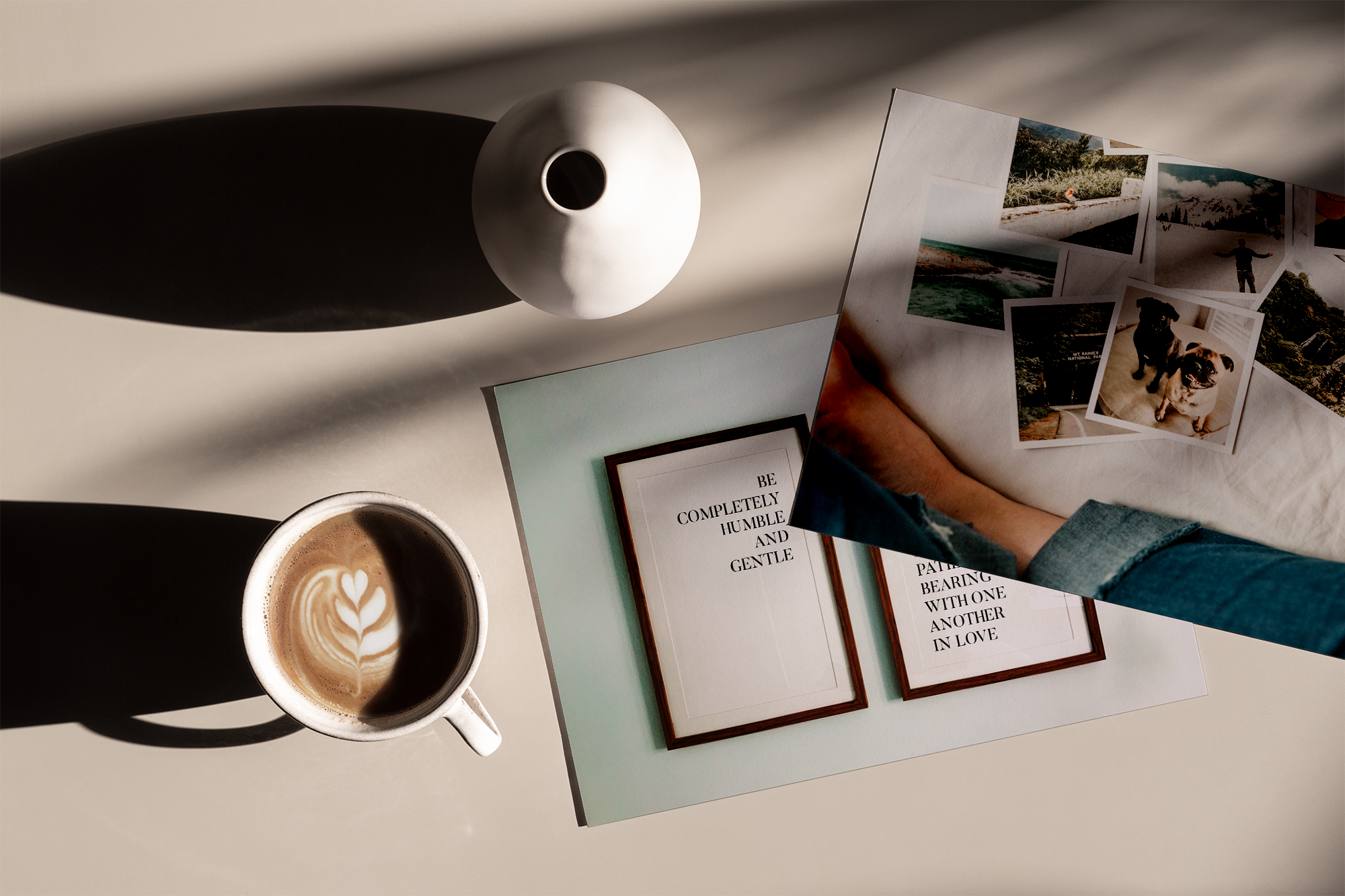
What’s Instagram without great pictures, am I right? Once you’ve figured out your brand style you’ll want to get clear on what types of images you want to share on the ‘Gram. Are you more of a light and airy person, or do you prefer moody photos, or vintage and rustic ones? Consistency is key here and you’ll want to really hone in on what you want to bring visually to the Instagram Table. So where do you find great images? You can take them yourself with your phone. These days it really is that simple, or you can find stock images on sites like unsplash.com and pexels.com, or hire a photographer to take branded shots of you in your element. Once you’ve collected some photos a great way to make sure they all have the same look and tone is through editing. I know that word can sound scary but there are amazing apps out there that really streamline the editing process with filters and presets, like Lightroom and VSCO. Just remember to have fun and remember that Instagram is a chance for you to showcase yourself and your brand in an awesome and intimate way, so being consistent is really key to creating that familiar connection with your ideal audience.
THREE | ORGANIZE YOUR GRID
There are so many different ways that you can organize your grid to make sure that it looks cohesive and streamlined. You can focus on colour keeping each post within a few colours, you can focus on layout, interchanging text and photos, or creating a checkerboard effect where you alternate between light and dark photos, or you can do something super daring like create a puzzle feed that essentially links all of your photos together. I often encourage my clients to start with a checkerboard feed, as it is the easiest to implement and especially in real estate when you have a lot of home content, you want to create visual anchors with certain posts so you don’t overwhelm your potential followers when they land on your profile. You need to decide how you want your grid to look. And then once you do that the trick is to stick to it. So, you might be thinking, “but what if I have a listing coming out and my colours don’t match it?” Glad you asked. If you have a listing that is bright and light and airy and your colours are muted and dark you can always do a carousel post where the first slide is one that has your brand colours and the rest are your listing photos. You can also apply a filter to the first photo that matches the look of your feed.
And there you have it, 3 steps to creating a grid that stands out on Instagram.