

Having your real estate brand designed is an exciting time. You get to dive deep into the world of your pretty colours, font, and your ideal customer. It can be one of the most exciting times for a new business but if you don’t have a design background some of the terminologies can leave you scratching your head or turning to the school of Google when you designer drops terms like “typography,” “submark” and “stacked logo”. Often when a branding project has been completed, my clients will ask me how and where they can use their many new assets. I get questions like, “what’s the difference between print and web files?” “Where do I use my submark?” And “How do I use those social media overlays?” So in an effort to help minimize the confusion, I thought it was time I put together a resource that would help to explain the what, why and how of each brand element so you can move forward with your new brand assets with confidence.
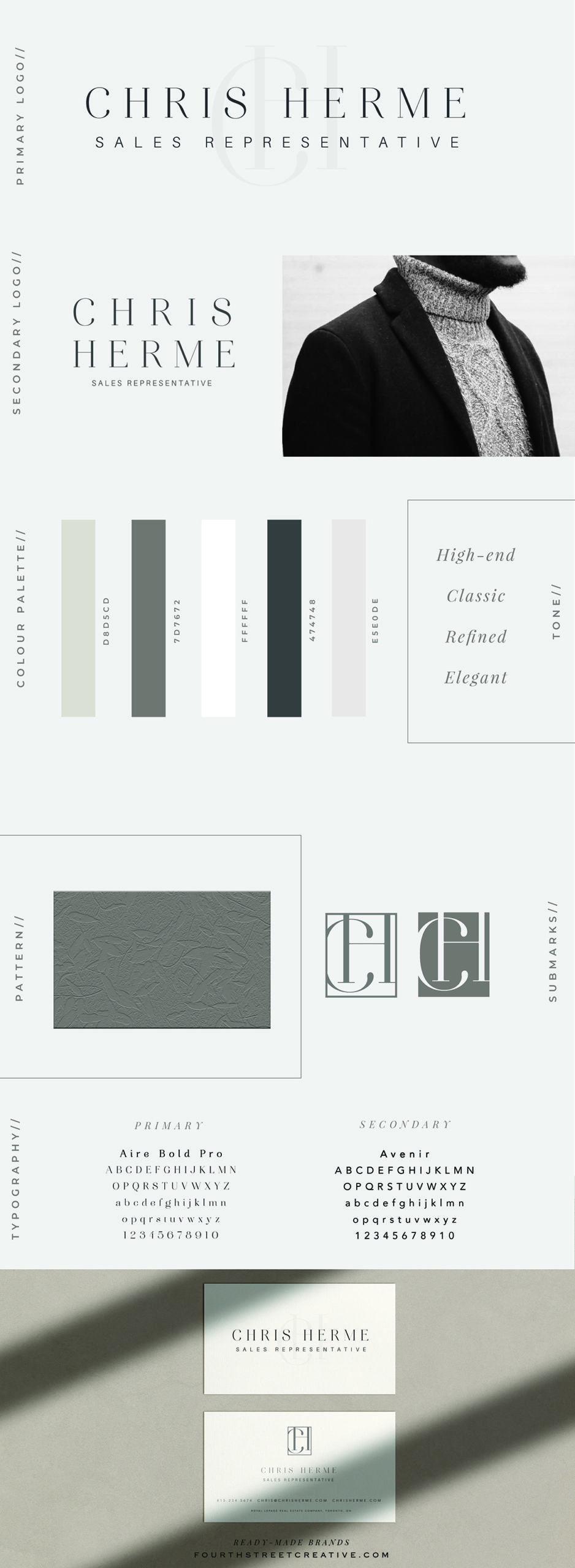
PRIMARY LOGO
This one is your main logo. I like to tell my clients that this is the star, the one you should reach for most often and the one you should be sharing and any and all marketing material that will allow. Your primary logo is usually how your clients will identify you, so you want to use it as often as possible to encourage the brand recognition process.
WHERE TO USE: Business cards, billboards, signage, stationery and website.
SECONDARY LOGO
This is the runner up, the one you will use when your primary logo just won’t work. Usually, your secondary logo is a stacked version of your primary logo, intended to be used in spaces that won’t’ allow for the first. This one will be helpful if you have square areas where space won’t allow for the first. This is the logo to be used on an as-needed basis.
WHERE TO USE: Profile picture areas, small areas, marketing material that has size restrictions.
SUBMARK
Do you know the Nike swoosh and Apple’s apple? Those are brand marks that can stand alone and still be recognized by most. Submarks are in line with the look and feel of your brand and can either stand-alone completely or reside as part of your primary and secondary logo. Generally, these marks add an extra layer to your marketing and when removed from your logo is still recognizable by your audience.
WHERE TO USE: Social media cards, social media avatars, favicon, stationery, business cards (as an added element), fun items ( ie. stamps.)
TYPOGRAPHY
Typography refers to how the type or font is arranged in your design, for this purpose your logo. I always tell my clients that typography is the most important part of any brand, and usually choosing or creating a type that will properly represent your brand is the most time-consuming part of the process. When it comes to branding you will most likely have a primary and secondary font, an accent font and one you use for communication like blog posts and website info. It’s important to stay consistent with these so your brand has a cohesive feel. Need some help with typography? Check out our article on font pairings HERE.
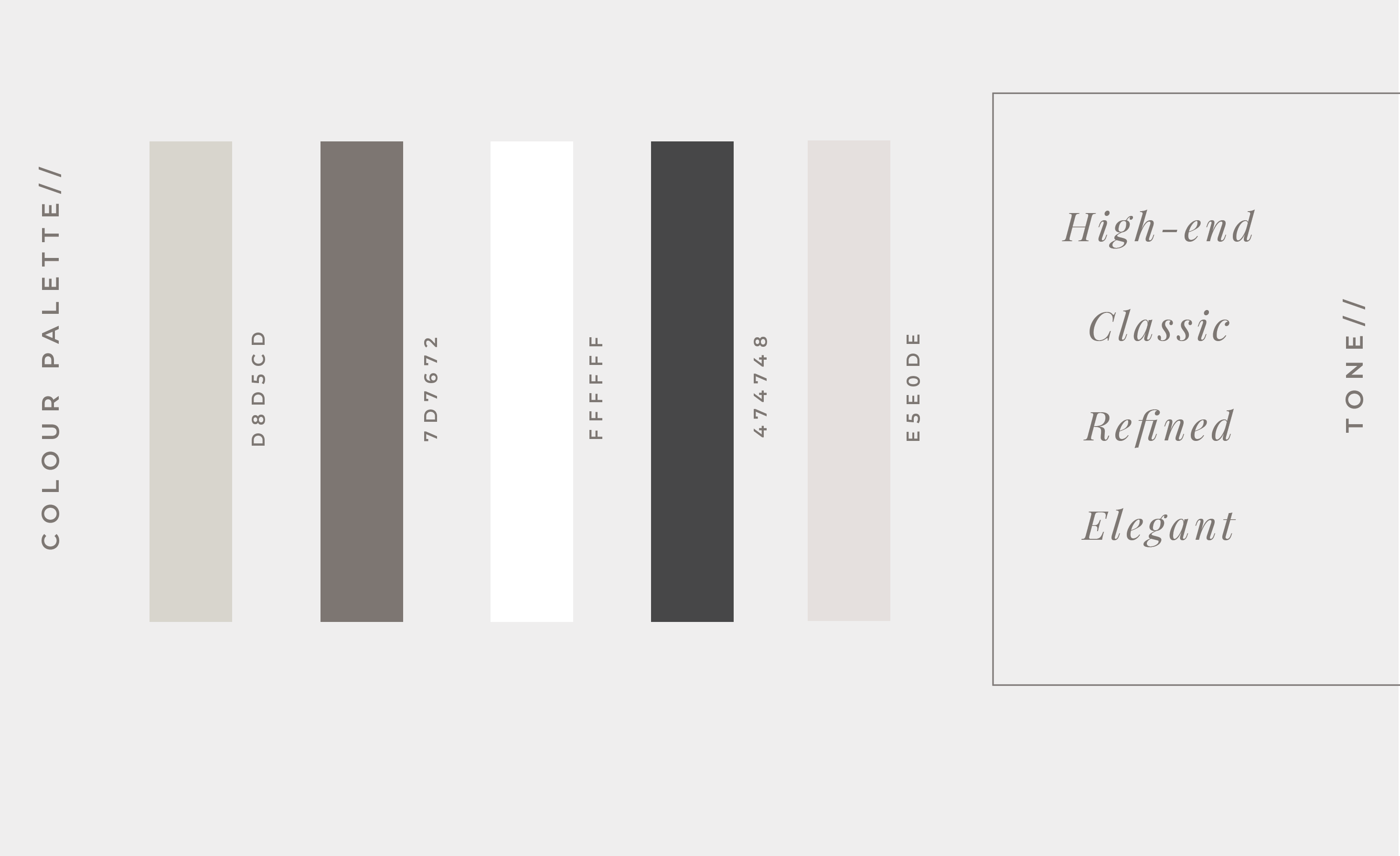
COLOUR PALETTE
These are your brand colours. Like typography, it’s important to stay consistent your brand will usually have 5-6 colours. 1-2 main colours, these are the go-to choices for any marketing you do. 2-3 accent colours, these compliment or add a pop of colour to your brand when needed, accent colours are just that, accents and shouldn’t be used as the main colour in your marketing. Your neutral colours are usually greys, creams, muted shades that help to fully round out your colour scheme, these neutrals are usually used as font colours or backgrounds for print.
BRAND PATTERN
Your brand pattern can help bring your brand to life and create a memorable experience for your clients. Patterns add a memorable component to an otherwise simple logo.
WHERE TO USE: social media, packaging, stationery and signage.
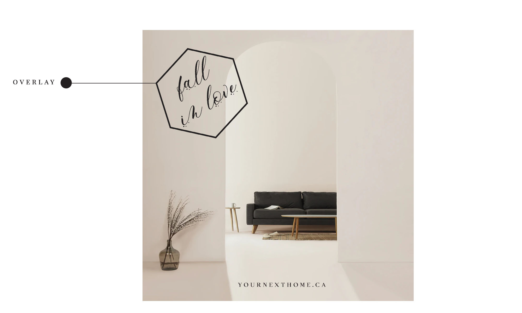
OVERLAYS
Our branding packages often include social media overlays with icons created to fit your new brand. Think cute little sold, just listed, and exclusive icons that are meant to add a cohesive feel to your social feed. Most of our clients use these overlays in Canva, importing the files and placing them over their images.
WHERE TO USE: Social media, postcards, flyers.
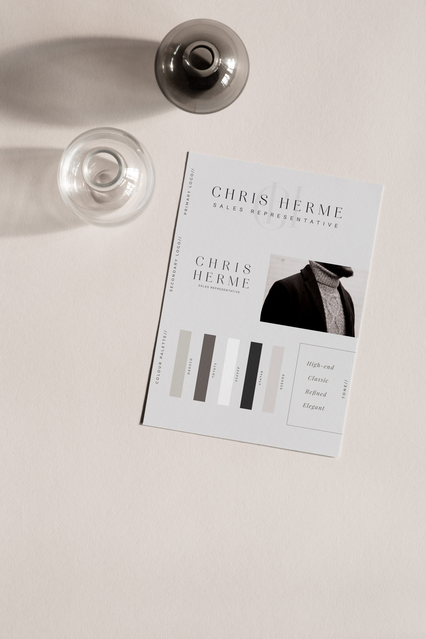
BRAND BOARD
This is a file that has all your branding elements in one neat and tidy space. This is a great resource to send to anyone who will do marketing projects for you in the future. It outlines your fonts, colours, logos, submark(s) and pattern. Having this a general overview of your brand is extremely helpful to designers who are very visual and can get an instant feel for your brand with this one document.
WHERE TO USE: send this file to anyone who is doing design work, web work, marketing work or as a resource for new team members.
I hope you are feeling less overwhelmed and ready to take your brand assets and run with them. It’s an exciting time for you and the world needs to see your new brand of awesome!