

Have you ever been designing in Canva only to take a step back and ask yourself: “Where did this go wrong?” Or: “What the heck, why does this look like crap?” If you have, you’re not alone…templates exist for a reason my friend!
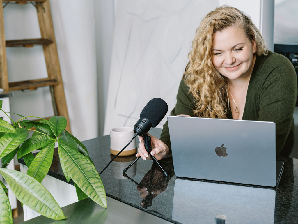
It can be so frustrating when you’ve got a post or a project in mind and it doesn’t turn out the way you wanted it to. The truth is designers tend to get the rep that we’re just born with the ability to make things look good. While there might be some creative genes at play, there are things you can do as a non-designer to kick your DIY designs up a notch (or three).
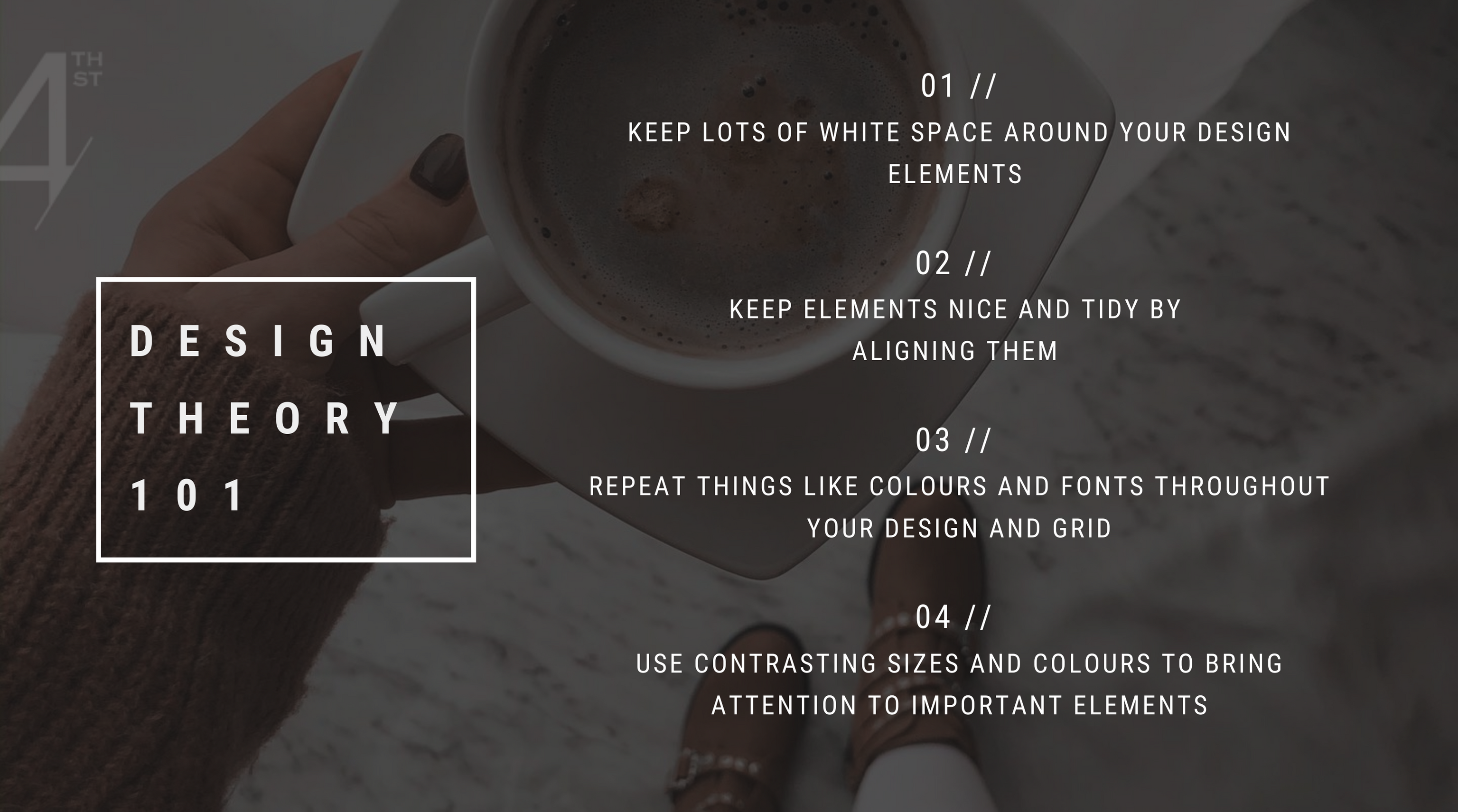
ONE | WHITE/NEGATIVE SPACE
Whitespace is the unused space around your design. We call this whitespace because there’s nothing on it – it’s just white. This white, or negative space, allows your artwork to breathe and has the potential to really focus your post content. When we create posts that are too busy (20 different colors, 7 fonts!) it can be difficult for your audience to understand what’s going on. So adding breathing room around words, images, and elements creates a clean image, one that’s beautiful and easy to look at. This is especially important on Instagram where you have one tiny square to create a big impact. My best tip for creating more whitespace in your designs? When you think you’ve finished, ask yourself what three things you could remove (Just like Coco Chanel always said, “Before you leave the house, look in the mirror and take one thing off. The goal is to streamline as much as possible while still telling a compelling story.
TWO | ALIGNMENT
Alignment simply means lining up text, graphics, or elements on a post or design. Alignment isn’t something that generally jumps out at you and makes you think, “Woah! This is some great alignment!” But if the alignment is off, you’re definitely going to notice, and you might say something like, “That doesn’t look right, dude… Not sure why but dang! That’s fugly!” If you want to avoid fugliness at all costs, then pay close attention to how you’re lining things up in Canva. Is your headline in the middle? Then, your subheading should be as well. Keep things organized in your design and the eyeballs of Instagram will thank you.
THREE | REPETITION
Repetition is reusing similar elements throughout your design. Think colours, font types, and imagery. You want to use repeating elements so you create a cohesive design. This just means…please don’t use 10 different fonts, colours, or tones on one post OR throughout your feed. I want you to think of repetition beyond the design element and use it as a strategy in your grid. Think about how you can create templates and then reuse them to create consistent repetition that helps your audience get familiar with your brand. When you have a consistent look and feel, it helps your audience understand the bigger picture of your messaging. Really, repetition just means simplifying your design process so that you’re repeating the same elements and looks over and over again. So once you’ve gotten clear on your colours, your brand fonts, your imagery, and your tone, then it becomes a lot easier to create that repetition throughout your designs both individually and as a whole.
FOUR | CONTRAST
Contrast is probably already part of your designs – you’re just not aware that you’re using it. But when you choose different fonts or use light and dark colours, you’re designing with contrast. You want to use contrast in the form of colours, fonts, sizing, etc. to bring attention to various parts of your design. So, let’s say you have a post with JUST LISTED as the heading and the property address “123 Your Listing” as the subheading. By using contrast, we can draw attention to the most important words by increasing the size. In this case, we want the audience to stop the scroll when they see the property image with the words “Just Listed,” so we’ll bump up that font and reduce the size of the property address, which is less important. Think of which design elements are most important and then ask yourself how you can use contrast to really pump up the volume so your audience better understands that importance.
And that is it, my friend! I hope that didn’t feel too much like you were in Design School 101. If you need a little more help getting started with these concepts, try grabbing some professionally designed templates from the shop that already use these concepts. Play around with them a bit to get more familiar with the ideas.