Do you ever stare at your Canva designs in horror, thinking, “What the heck am I doing here?! I’m a Realtor – not a designer!!!” I hear ya! Once upon a time, I was just a girl, sitting in front of a computer, asking it to love her (enough to teach her the ways of design)!
This self-taught designer has learned a thing or two (or ten thousand) over the last 16 years, so when I see the same mistakes being made over and over (and over…) again I feel I need to step in and whisper (or, you know, shout) ever so gently: “Stop! Like, immediately!” Because, boo, your brand has the potential to be stellar, and there’s absolutely a cure for sub-par design. And it’s all about avoiding the biggest design mistakes.
OVERCOMPLICATING YOUR DESIGNS
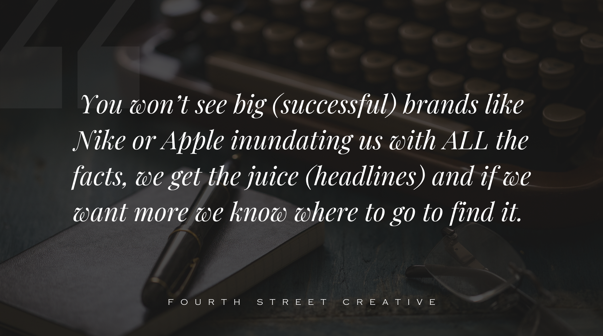
Design is a delicate balance of… Just kidding. Let’s keep it super real up in here and just use the KISS principle. (For those of you who skipped all your high school English classes, KISS stands for Keep It Simple, Stupid. In my version stupid = stud because doesn’t that feel better?) Stick to minimal images (one image per square is plenty!), don’t add your headshot to every post (those squares are way too small to fit more than one focus.)and please, for the love of design, stop writing a novel on your posts or marketing pieces. This isn’t a who wrote more competition! (We really don’t need to know the complete history and feature breakdown of the house…) You won’t see big (successful) brands like Nike or Apple inundating us with ALL the facts – they give us the juice (headlines) and if we want more we know where to find it.
TRYING OUT A BUNCH OF DIFFERENT LOOKS (LIKE…WAY TOO MANY!)
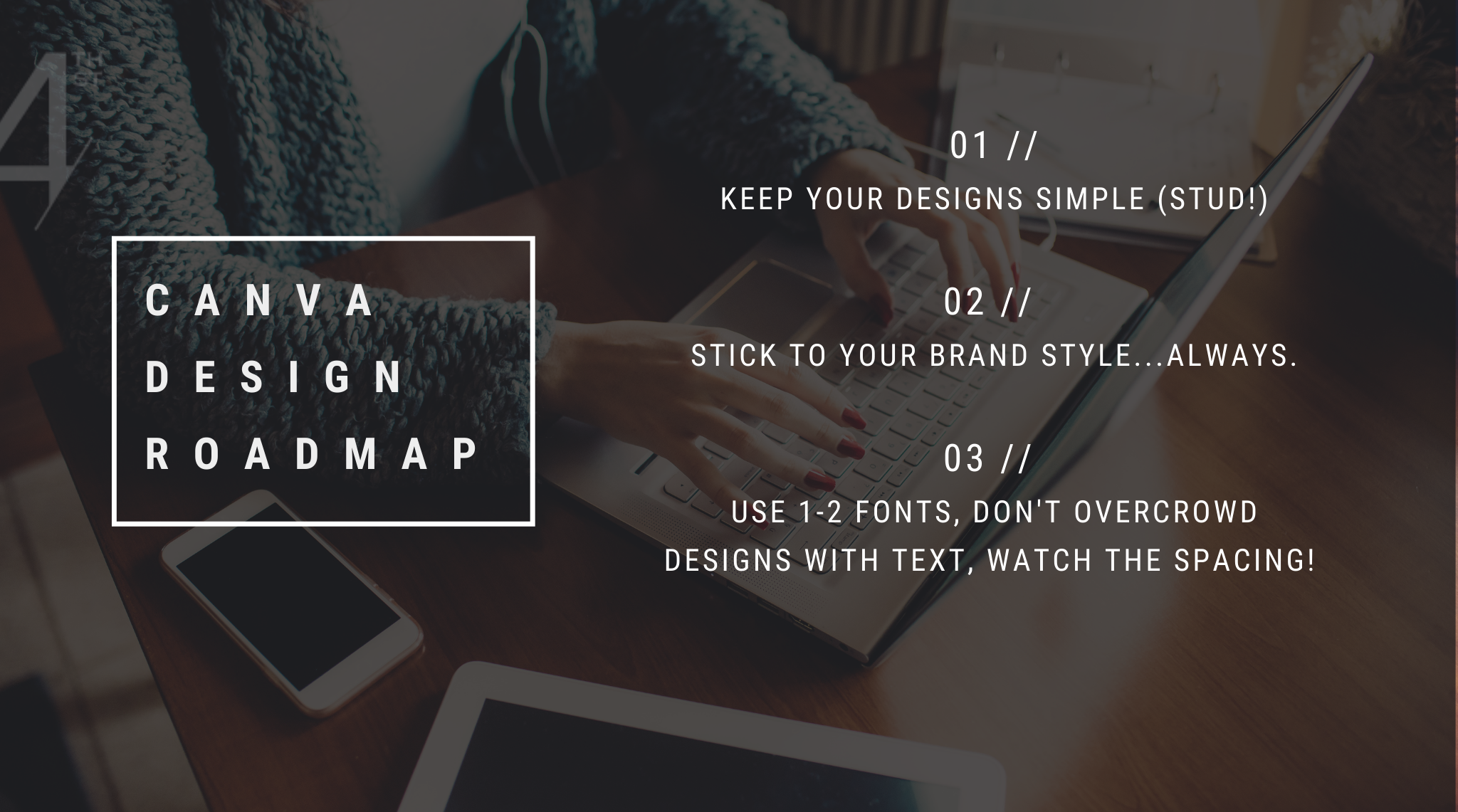
If you don’t have a style guide that outlines your brand colours and fonts, then you, boo, need to do some work! Head over to my Insta-Style Quiz so you can get clarity around all things branding for the ‘gram and then get to work on sticking to ONE look throughout all of your marketing. Having a video edited? Send the video editor your brand guide so they use fonts and colours. Sending out a neighbourhood flyer? Send your designer your assets so they use the right imagery and style. Having a cohesive look across the board means a more recognizable brand for you. Plus, repetition in marketing is how people remember your content, so establish your look and stick to it. (Yes, that means no more playing around with all the pretty templates in Canva…unless you’re willing to customize them to fit your brand style!)
OVERUSING OR MISUSING FONTS
Oh, my friend, fonts are fabulous, but only if you know how to use their unique power to tell a story. If you struggle with making your Canva designs look stellar, then pick two fonts that complement each other and call it a day! (Hint: opposites attract, so choose fonts with different weights and/or styles. And, PLEASE, no Comic Sans. Please.
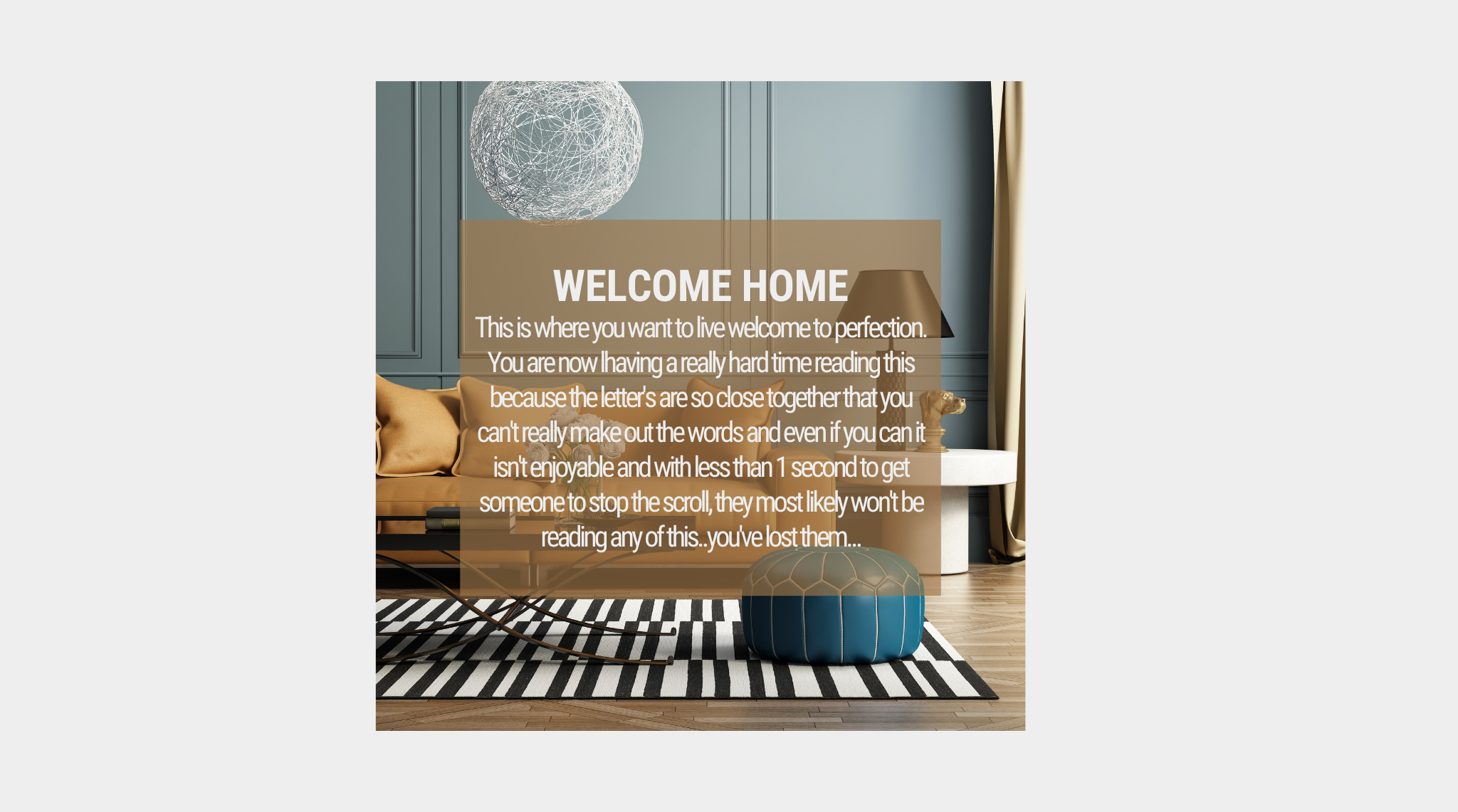
You also want to pay attention to kerning (the space between your letters) please don’t do this…
Instead keep things legible and crisp and easy on the eyes – like this…
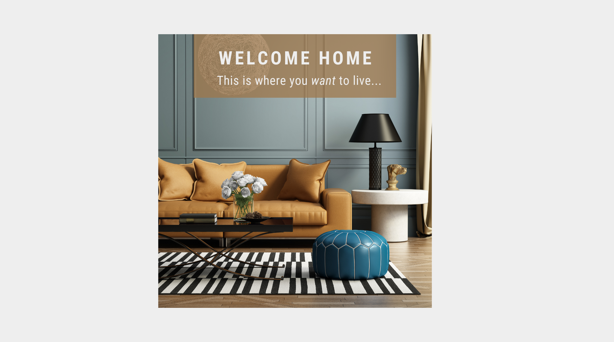
Have a ton of info you want to share in one post? Create a carousel and break up the important points on multiple slides. You’ll get way more eyeballs on your content when your audience isn’t getting a migraine trying to make out the words you smushed together.
And lastly, please use contrast with fonts. Make sure the most important information is the largest (i.e., “open house”) and then move down in size as the information becomes less important (i.e., the property address and details). If you’re creating an Instagram post, I urge you to put almost ALL the copy in the caption ..remember that KISS rule? Use it. Love it. Keep it simple, stud.
Try these out and then share your results! I’d love to see how you applied these ideas to your designs tag @foruthstreetcreative on the ‘gram or shoot me an email so I can take a peek!
