Stuck trying to make your Instagram feed look stellar with little success? Don’t worry you’re not alone! This is the number 1 question I get asked almost on a daily basis, realtors from all over the globe jump into my DM’s to ask how they can create a beautiful looking feed. Below are my best suggestions. Here are 5 things you can do today to get that perfectly branded IG grid.
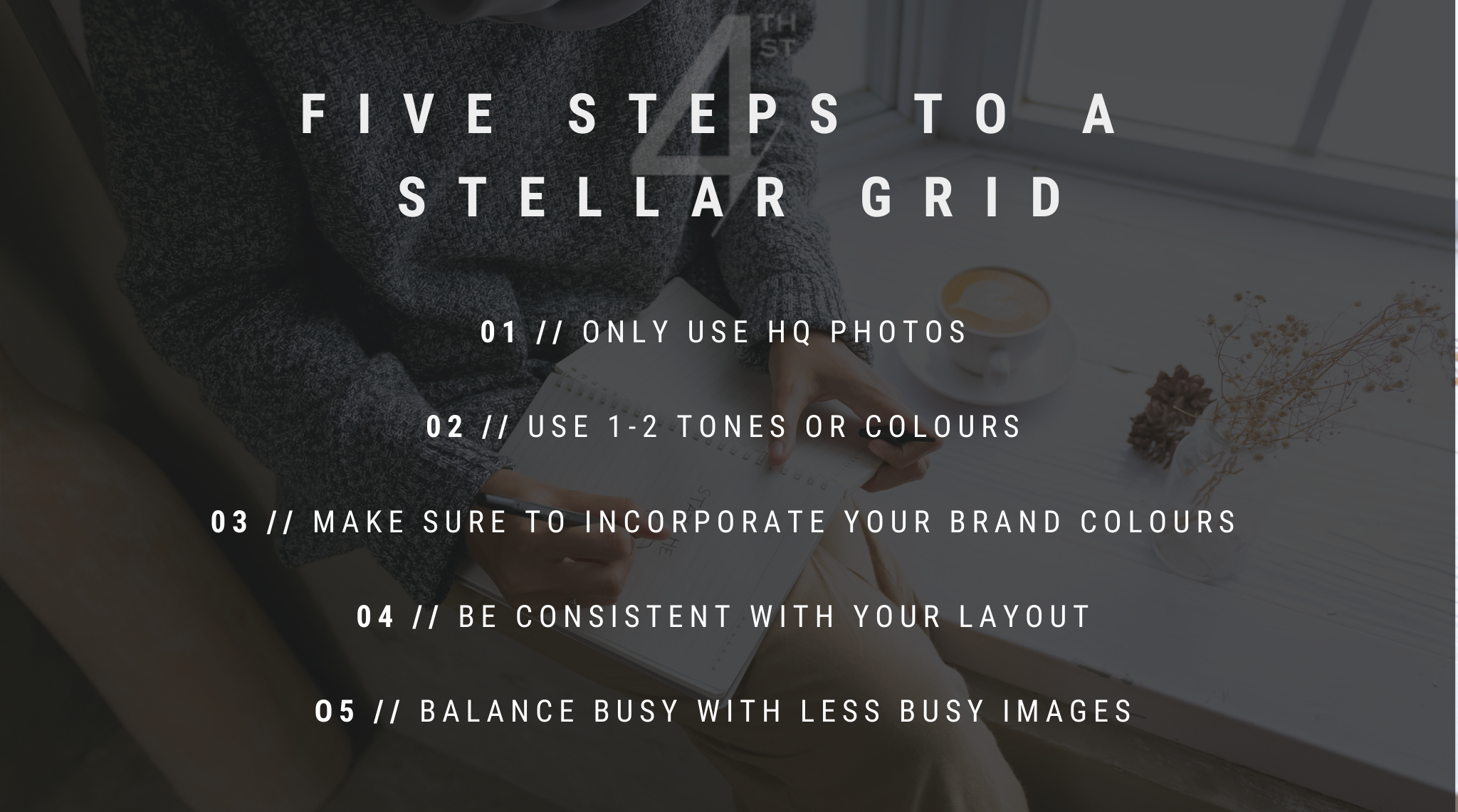
ONE | HIGH QUALITY PHOTOS
Listen up friends, Instagram is a visual platform. Unlike sites such as Twitter, the name of the game on Instagram is beautiful or captivating/interesting photos that engage our senses and make us want to tap that heart button. If you are a service based business or personal brand (as a realtor you are both!) you really want to streamline your content with high quality images that make your feed look more professional. Imagine a potential seller, landing on your profile only to see blurry or messy content… they might wonder if that’s your go-to standard and leave it right there. That means save that photo that’s kind of blurry (but totally hilarious) of you falling down face first in the snow off of your grid. If you really feel inclined to share blurry or less than stellar photos pop them into your stories where they will live and die in 24 hours and where the need for that perfectly branded look is less important.
TWO | CHOOSE A TONE
Are you light, bright and airy? Moody and sleek? Boho chic? Pick one and stick to it! But how do you even do that Melanie? Glad you asked. Tones come out in to play with the use of filters (limit yourself to 2) and colours (choose a colour a palette and don’t deviate) as well as the type and style of photo. Be aware of these three things and aim for consistency and your feed will thank you. If you’re not sure what your tone is take this 2-minute quiz that will give you insight into your brand style.
THREE | COLOUR COORDINATE
Similar to choosing a tone, you want your posts to be colour coordinated. This means the colours in your colour palette should be represented in every single photo. Here’s a pro tip, incorporate elements of your palette into your wardrobe or backdrops when snapping pics that way photos of you will always fit into your feed. Have a listing that just doesn’t match? No problem. Head into Canva and drop a square element over your listing photo, then change the colour to one in your palette, then adjust the transparency so you can see the listing behind it…voila! That listing photo will seamlessly blend into your grid.
FOUR | CHOOSE A LAYOUT OR GRID PATTERN
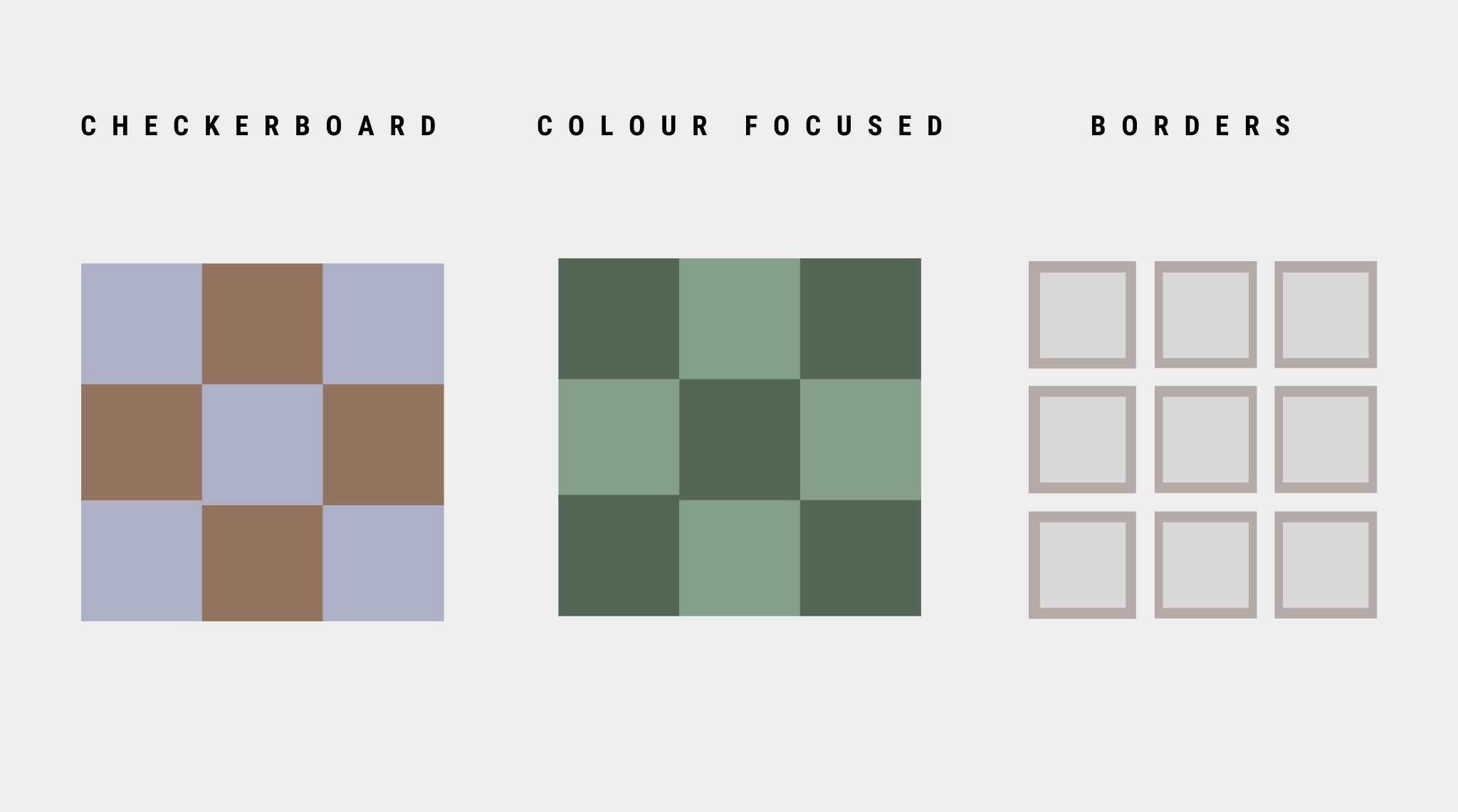
The layout of your grid is also key, you can have a grid that is just a variation of your colour palette, a checkerboard grid where you alternate between types images or colours or do something fun with borders. Having an intentional layout helps tell a story and paint the picture of your unique brand.
FIVE | BALANCE IS KEY
Have you ever landed on someone’s profile and were instantly met with a “messy feed” you know the one where the photos, content and tone were all over the place? It was hard to even focus on one photo because they were all just so … busy? I don’t know about you but It doesn’t take me long to get on out of there as fast as I can, which is why balance is so important, you want to invite your audience into each post and create space amongst those tiny squares. The trick to doing this is to position photos strategically throughout your grid, you want to alternate between busy and less busy photos, you might want to give the detailed living room shots a break and insert a quote to lighten up the space, or break up a lot of the same colour with another one from you palette. A great tool for taking a step back and seeing how everything will look together once posted is Preview, this app allows you to move all your posts around until you have a grid that visually works, doing this before heading into Instagram is a total game changer and removes the need to guess as to how a post will look in the bigger picture.


