So you signed up for Canva and are ready to get going designing your killer graphics for Instagram and beyond. You open your canvas and realize within a few short minutes (or seconds), “hold up, I have no clue where to start or how to make this look good!” IF this sounds like you, don’t fret, you’re not alone. Designing anything can be super intimidating especially when you are brand spanking new to this world and don’t have any design experience. luckily Canva is extremely user friendly and has even become the go-to platform for this previous Indesign and Photoshop lover.
The truth is design can be as easy as grabbing a template from the 100s of selections Canva offers, switching out colours and fonts to match your brand style and adding in your own unique messaging. Canva makes it that easy! But there are a few things you will want to keep in mind when you are altering these templates and especially if you are designing from scratch.
So let’s dive in, and take a look at my top-10 design tips for the total beginner.
1 | WHO IS THIS FOR?
Before you even begin to think of aspects of your design, you should always start with a crystal clear idea of who you are designing for. Knowing who you want viewing your work can influence every part of your design, from colours, to font choice to messaging.
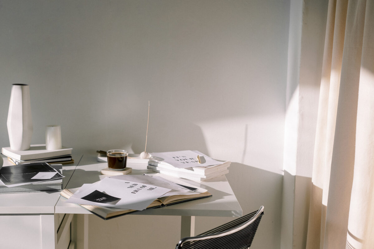
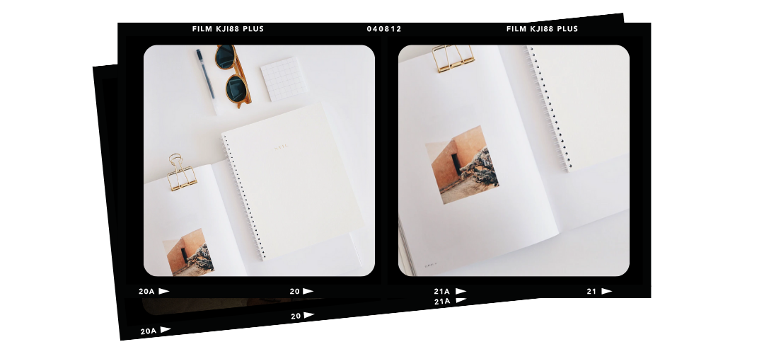
2 | WHITE SPACECluttered design is sloppy design. Keep things clean with ample space around your elements. Creating breathing room around elements of your design increases readability and the overall enjoyment of the viewer.
3 | CHOOSE 1-2 FONTS
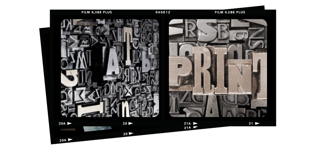
Limiting your fonts allows for clarity in your design. The font can set the tone of your artwork so limiting your fonts allows your messaging to come through. Pro tip: opposites attract if you choose a classic font for your heading, choose a modern font for subheadings and vice versa.
4| CHOOSE 1-2 COLOURS
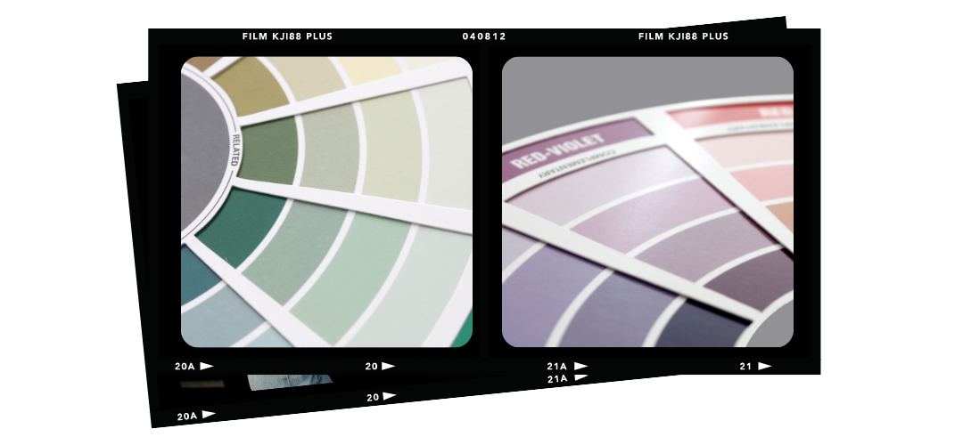
Similar to fonts having too many colours in your design and overwhelm the reader. Keep it simple with 1-2 colours. Stuck on where to find colour inspo? canva.com/colors has everything you need.
5 | LOOK FOR INSPIRATION
If you get stuck or feel overwhelmed when trying to come up with designs, head over to Pinterest, type in the design you are looking to create and spend a few minutes browsing..you’ll be surprised how well this works to remove any creative blocks.
6 | CONSIDER TONE
If your brand is boho chic, your artwork should be boho chic, if you’re more modern minimal your designs should represent that as well. Pro Tip: keep a Pinterest board with the tone of your brand filled with images, colours and styles that you can refer back to when you need a little reminder.
7 | PROXIMITY
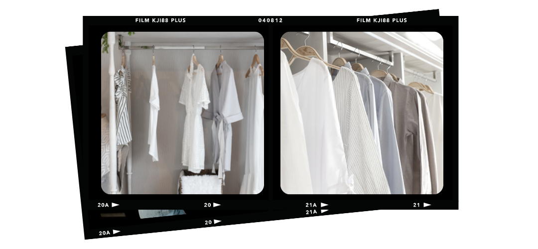
Proximity in design simply refers to grouping similar elements together so that there is a natural flow to your design. Designs can become sloppy when you scatter related information all over the post, or marketing piece. Grouping related elements together allows your audience to better understand the messaging.
8 | STEP AWAY
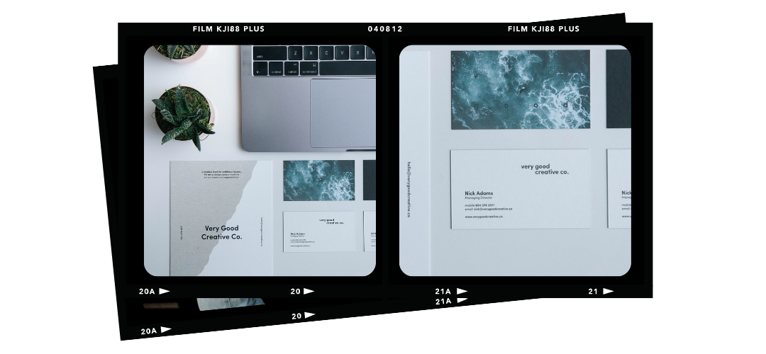
Everyone can get “designers block” from time to time, that feeling that you just can’t see if what you’ve created is any good. When this happens refrain from ditching your designs and instead take a step back, grab a coffee and take a pause. When you come back to your design you’ll be able to see it with fresh eyes.

9 | BE CONSISTENT
It can be tempting to shake things up every other week, but your artwork should remain consistent throughout all of your designs if you’re trying to create brand awareness. Use the same colours and fonts and imagery to create a nice cohesive look.

10 | LESS IS MORE
When in doubt keep it simple. If you’re not a designer by trade you’ll want to rely on simplicity to get your message across. Ask yourself if everything in your design has a purpose, if the answer is no, it probably doesn’t need to be there.
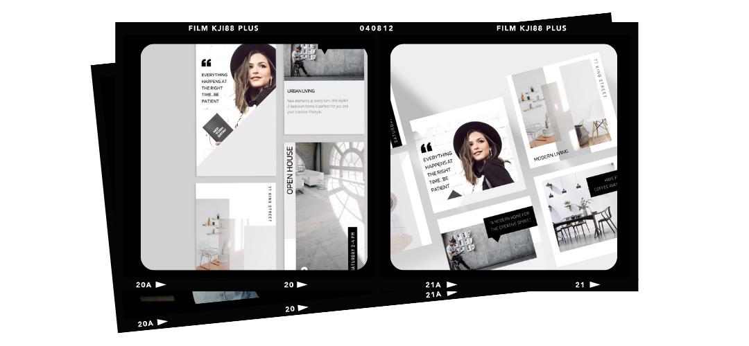
Visit the Template Shop to get a head start on your Canva designs with easy-to-edit, stylish templates for your property marketing, social media and beyond…
