Once you have your brand assets hammered out (*gasp* You don’t? What are you waiting for?! Take the Brand Style quiz to get started!), it’s time to put all those pretty visuals into a nice, neat brand board. This is a quick and easy, one-page document you can hand off to anyone who needs an at-a-glance peek into your brand, like photographers, marketers, graphic designs, and especially new team members who might not understand your unique brand aesthetic (yet!).
Your brand board will save you the seemingly never-ending back-and-forth emails trying to explain what you like and what you don’t like…and will prevent that dang Princess Sofia typeface from showing up on your designs when you very clearly said you don’t like “fancy fonts.”
Let’s say you hire Sarah, a marketing guru, to help with your print marketing materials, website, or social media. Instead of exchanging a bajillion and one emails as she gets up to speed, you can simply send her your brand board. The result? Instant clarity and cohesive branding across all channels – and a happy Sarah who doesn’t have to guess what you might want in your design! (And a very happy you, might I add…)
This is a FANTASTIC tool, and we’re going to show you exactly how to create one step-by-step in Canva.
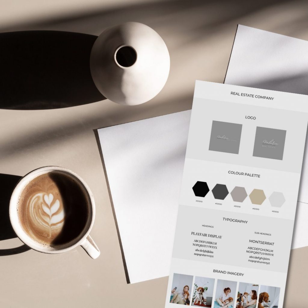
SET UP
- Log into your Canva account and hit “Create a Design.”
- Select “Custom Size” and enter 1500 pixels by 3000 pixels.
- Hit “T” on your keyboard to pull up a text box, then type in the name of your company. Then, move this to the top of the board.
- Copy and paste the text box 4 more times (5 text boxes total – company, logo, typography, colours, brand imagery) and space them out from top to bottom.
- Pro tip: The shortcut for copy and paste is command C / command V on your keyboard!
1 | LOGO
- Upload your logo into Canva (a JPEG or PNG file will work) or select a pre-made Canva logo and customize it!
- Resize it if necessary and place it underneath the logo section.
Pro tip: Two logos is better than one! Ideally, you’ll have two variations of your logo – your primary logo (used as often as possible in your marketing) and a stacked logo (used when your primary logo doesn’t fit due to size constraints or just isn’t appropriate).
2 | COLOUR PALETTE
- Head to the panel on the left side of your screen and click “Elements.” Then, select a shape you want to use to showcase your colour palettes. (You can choose any shape you want – a circle, a square, a squircle…).
- Copy and paste the shape so you have multiples and line them up under the “Colours” heading using your smart guides. (Our example shows a colour palette with five brand colours. Remember that you’ll want 1 to 2 primary colours and 2 to 3 secondary colours!)
- If you already have a colour palette for your brand, simply select the shape, head to the colour picker, hit the plus sign, and drop your HEX code in. You’ll repeat that easy peasy process for every colour.
- If you don’t already have a colour palette, head to canva.com/colours to use their resources to help you define your brand’s colour palette!
Pro tip: Not sure where to start when selecting brand colours? Head to pinterest.com and select a photo you love, then drop it into Canva’s colour palette generator! So. Much. Fun.
3 | TYPOGRAPHY (FONTS)
Listen, you can have as many fonts for your brand as you want, but we recommend sticking with 2 (1 for headings and 1 for subheadings) to keep things simple.
- Create (or copy) a text box and bring it down under the “Typography” heading.
- Put the title of your first font – the one you want to use for your headings – in the chosen font. Underneath, type out the alphabet. Make sure you do the entire alphabet in all caps and then again in lowercase underneath so anyone looking at your brand board immediately sees what your brand fonts will look like in use!
- Duplicate all of that and follow the same process for your secondary font (the one you want to use for your subheadings). Then, use Canva’s handy smart guides to space them evenly.
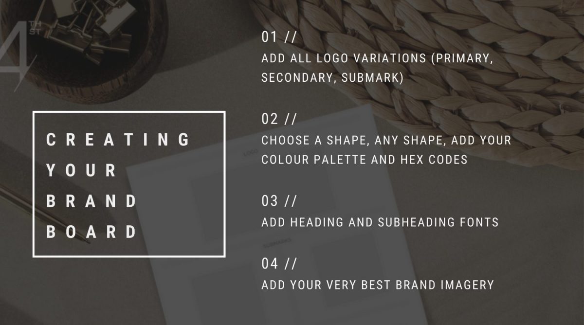
4 | BRAND IMAGERY
- Select a rectangular frame (or simply select the first photo you want to work with), duplicate it 4 times, and then space them out evenly. You’ll end up with 5 total frames (or photos – you do you, boo).
- Mindfully select several photos that you feel convey your brand’s aesthetic or tone. You can use photos directly from Canva or import some of your own – whatever best captures your vibe. Then, simply drag and drop each photo into a corresponding frame.
- Incorporating these images into your brand board will help anyone who references it understand your brand better and ensure a cohesive look throughout your marketing!
Pro tip: When you find a photo you like in Canva, click on the 3 dots at the top right corner of the photo to head to the photographer’s gallery.
5 | FORMATTING
- Head over to “Elements,” ad grab the square, and then make it a very light (close to white but not quite!) colour.
- Right click and select “Send to Back.” Now, you can use this as a background to separate the sections of your brand board! Simply alternate between white and off-white, section by section.
- Go over the elements of your brand board using smart guides to make sure everything is evenly spaced and lining up nicely.
- Finally, create one last text box and centre it at the bottom of the board. This is where you’ll enter your website.
Et voila! You’ve got a clear and cohesive brand board that your team can use as a reference. Your brand will be consistent – and feel 100% more trustworthy to your customers.

Not sure where to start? Browse our Template Shop for inspo, or take the Insta Style quiz below!


