

Trying to navigate your designs in Canva can be tricky if you weren’t trained in design. I mean seriously trying to figure out things like layout and composition, proximity, how to use colours and fonts is not a struggle you signed up for, am I right? Having worked closely with thousands of clients, I understand the struggle which is why I decided to put together these Canva tips for you, these are things that I do while designing and if you adopt them as well I can guarantee your designs will look stellar every time!
One | Ask Yourself, “Who is this for?”
Before you even start the actual choosing of colours and fonts, the very first thing you want to do is ask yourself “who am I designing this for?” Is it for first-time buyers? Home sellers? New Families? I always start off any design project by digging deep and asking questions so each project will have intention behind it. It’s important to have somebody in mind which will give you a great basepoint for every single element in your design. Whether it’s the colour, layout, or fonts, knowing who needs to see it, and who needs to be attracted to it is so very important.
So if you’re trying to sell a small 2-bedroom townhome then you know this isn’t for a big family, it’s most likely for a couple or at the very most a new family. You might want to showcase different rooms to emphasize the lifestyle or use certain language in your call-to-action. When you really drill down and you know exactly who the design is for everything about your design becomes much simpler. The next time you put any piece of marketing material together whether it’s a post, a postcard, a flyer, or an email, ask yourself who the intended audience is.
Two | Consider Proximity
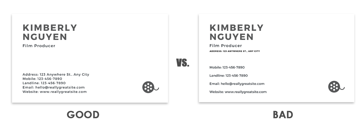
Proximity in design simply refers to grouping similar elements together so that there is a natural flow to your design. Now when you are designing a business card, for example, you want all the contact info grouped together, if you are doing a post for social media you want to keep the property info grouped. Designs can become sloppy when you scatter related information all over the post, or marketing piece. Always be thinking of grouping elements together so your audience can better understand the messaging.
Three | Limit your Colours
When you’re new to design it can be so tempting to use all the colours of the rainbow and to really experiment with everything Canva has to offer. But if you’re trying to create a cohesive design. It’s really important to create a simple, refined, complementary colour palette. When you use too many colours you can overwhelm a design and even worse, confuse or turn off your audience. So how do you choose your colours? If you have brand assets, choose two of your colours if you don’t have brand assets then try to keep your colours neutral and complimentary. Canva has amazing resources to get you started with choosing colour. Head over HERE to explore my hands down favourite Canva tool.
Four | Choose your Fonts Carefully
What I see happening a lot of the time is the use of unprofessional fonts or fonts that don’t work for the tone or the messaging of the marketing piece. Something that is often overlooked is that fonts convey emotion. Decorative fonts can be playful, which comes across as jovial. Serif fonts come across as classic and timeless. Sans serif fonts are modern and clean. So, when you are choosing your fonts, it’s really important to make sure that the message matches the font. And if you don’t have brand fonts that you’re using across the board, then think about your messaging. Are you trying to appeal to a younger audience? Are you trying to appeal to a higher-end, luxury audience? Always think of the tone you want to convey with your messaging and then choose your fonts accordingly.
Five | Less is More
This is the cardinal rule of design. Don’t over clutter your design, and make really good use of white space. when you’re creating a social media post for real estate, try to focus on one house or one objective. One of the biggest mistakes I see with real estate marketing is on farming flyers. Oh boy! If you’re doing a flyer or postcard it can be so tempting to try to fit all the information into one card you know advertise ALL the houses you have for sale in hopes that someone will pick one from those twenty little squares that they need a magnifying glass to even make out. This ends up looking more like junk mail and screams “look at me, look at how important I am!” Remember that the focus should never be on you and how great you are the focus should always be on attracting the right buyer. If you start to think about design in that way, then you always come back to the less is more because your viewer and your reader appreciate clear, concise design.