Whether you love or hate them, there is one thing that will always be true: fonts play a major role in how your brand communicates with the world. Every font has a distinct personality or mood and conveys a specific message or tone. I can’t tell you how much it hurts me when I hear “Melanie, I tried to do this myself in Canva and … it just didn’t look right.” Seriously, those exact words have landed in my inbox countless times, and the truth is 9 times out of 10 the problem is font choice and general typography mishaps. So, in an effort to help guide you on your DIY journey, I’ve compiled a list of 24 Canva font pairings broken up into the “Fourth Street Six” Brand Styles, as well as some general guidelines to follow. Ready to get this font party started? Let’s dive in…
Classic Luxe Fonts
Think elevated elegance with a splash of ornate appeal. High-end meets glam queen, classic meets superstar! These fonts work with Classic Luxe Brand styles.
Feminine & Elegant Fonts
This brand is on the softer side of things and these fonts relay just that. With oodles of sophistication and a killer eye for detail, these fonts are the cherry on top of a welcoming, gorgeous design.
Colourful & Bold Fonts
When you think of this brand think fearless and outside the box. And when picking fonts for the Colourful and Bold style- it’s all about making heads turn and (most importantly) having fun!
Modern Minimalist Fonts
The brand is all about clean lines and uncomplicated design. And the fonts used for this brand are all in line with that. They are simple, straightforward and refreshing.
Rustic Fonts
Flashy fonts are not welcome here. Think authentic with a side of grit or refined sophistication with a side of rustic charm.
Vintage Fonts
This brand is all about timeless charm. All fonts for this brand should feel like it could be from any era. This brand is confident and carefree with a splash of sophistication.
General guidelines
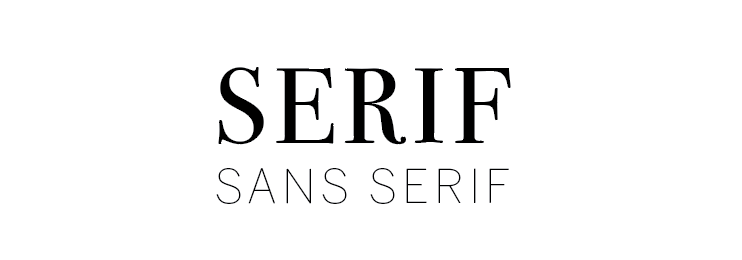
ONE | Pair Serif fonts with Sans serif fonts
SERIF: These types of fonts have ‘feet’ and varying stroke sizes. The tone is classic, high-end and sophisticated
SANS SERIF: This will have a consistent stroke thickness and no “feet”. Think simple, clean and modern.
 Two | Paragraph fonts should be legible and easy to read
When choosing your paragraph font make sure it’s easy to read, stay away from cursive fonts or fonts that are too narrow or thin.
Three | Play with spacing to find the right balance
In Canva you have a nifty spacing tool that allows you to manipulate the space between letters and the line height (the space between sentences). This is a great way to add visual appeal to your headings, play around with the spacing until you are satisfied with the look.
Four | When in doubt keep it simple
Not sure what to do or where to start? You can always keep it simple by using one clean, modern font like Acherus Grotesque or Oswald, making your headings bold and slightly larger than the paragraph size. This is universally the easiest way to make your marketing pieces look professional without wanting to tear your hair out.
Want to take the guesswork out of Font Pairings? Head over to our template shop.


