You’ve poured your heart and soul into creating a stunning property brochure in Canva. It’s a masterpiece! But why limit yourself to paper when you can bring it to life online? With Canva’s magic, you can transform your brochure into a captivating website in no time. Imagine a property website that perfectly matches your brand and showcases your listings like never before. Ready to make something drool-worthy? Let’s go!
Step 1: Perfect Your Property Brochure
Before we dive into the website creation, let’s make sure your brochure is in tip-top shape. Open your Canva design and ensure every element is exactly how you want it. Check your images, text, and overall layout. This is crucial because we’ll be transferring this design directly to your website. While landscape orientation typically works best for websites, portrait-format brochures can also be adapted.

Step 2: Copy and Resize
Now, it’s time for the magic to happen. At the top of your Canva screen, you’ll see a tool called “Resize & Magic Switch” Click on that, and a box will pop up asking you to choose a new size. Type in “website” and hit enter. Canva will work its magic and transform your brochure into a basic website layout.

Step 3: Adjustments
Alright, now comes the fun part: turning your brochure into an interactive website. Each page of your brochure will become a section on your website. Think of it as building a digital floor plan. Canva makes this super easy. You can drag and drop these sections to rearrange them, making sure the flow feels natural and inviting. Want a bigger section to highlight a key feature? No problem, just resize it by dragging the corners. It’s like playing with digital building blocks, but way more fun.

Step 4: Refine your Design
Okay, now it’s time to make your website truly yours. Picture this: you’re decorating your dream room. This is your chance to add your personal touch. Play around with colors, fonts, and images to create a space that reflects your brand. You can even add those little design quirks that make your style unique. Think of it as giving your website a personality makeover.

Step 5: Bring Your Property to Life
Let’s make your website pop! Add some pizzazz with visuals and media.
- Got a property tour or footage you want to include of yourself talking about the property? Drag and drop one of those videos onto your website in place of a photo.
- Delete any “pages” (aka sections) that don’t feel necessary or overcrowd the site
- Add subtle animations to grab attention or consider interactive elements like clickable floor plans or links to virtual tours

Step 6: Contact Info
Your final section which used to be the back page of your property brochure houses all your contact details you can add links to your regular contact page, or insert a mailto: link so that when they click the button it will open up in their own email. You can links to your Whatsapp or anything yu’d like just make sure there is an easy way for them to contact you.

Step 7: Publish your Website
You’ve created something amazing, so let’s share it with the world. Hit that big, bold “Publish Website” button in Canva. You’ll have options to customize your website’s URL, SEO settings, and even mobile responsiveness (be warned Canva’s mobile responsiveness isn’t the best yet so I usually leave that box unchecked). Have fun exploring your options and take a peek at your final result. If you need to make tweaks it couldn’t be easier just head back to your workspace and make the changes you’d like to see and publish again.

Make sure to copy the link to share with your clients, potential buyers and other agents who just might ask who your web designer is 😉
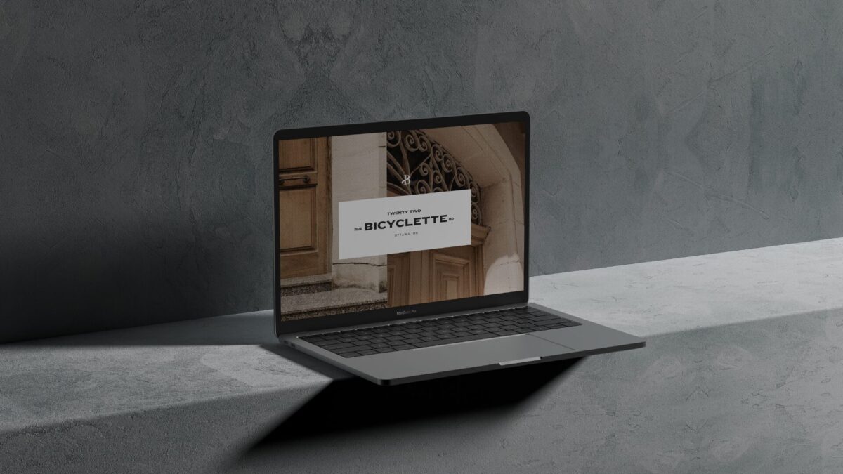
Loved the Bicyclette Luxury Brochure used in this post? Head over HERE to snag it!

