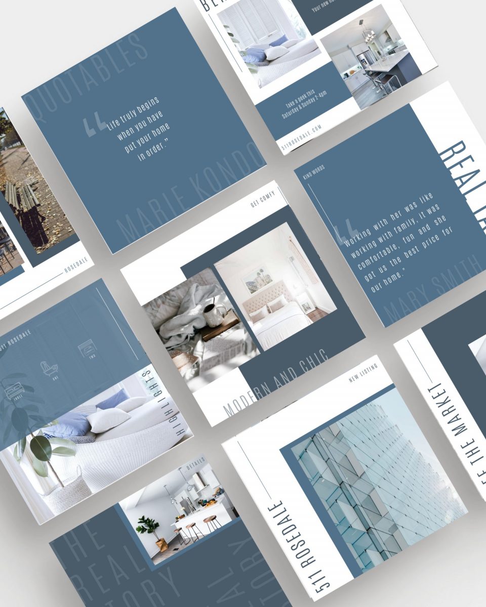
Have you ever stumbled upon someone’s Instagram feed, only to be stopped dead in your tracks, overtaken with the beauty and magazine-like look and feel of their images and posts? I know I have, and when I do, I never want to leave. It’s like browsing through the pages of your favourite issue of Vogue, or Style at Home. A curated, cohesive Instagram brand not only looks fabulous but can keep people coming back to your content, wanting to engage and follow you as well. The truth is without a strategy to develop your aesthetic, you may be overlooked by potential clients who are looking for a certain somethin’ that your feed just doesn’t offer. If you’re struggling to define the look and feel of your feed, read on for our 5 actionable strategies for realtors, on how you can create a cohesive brand look on the ‘Gram!
ONE | BRAND BUCKETS
Brand buckets are 5-9 things your brand is known for. As a realtor, you might feel inclined to post about listings and market stats only, but I would urge you to think broader and let your personality shine to create connections with potential clients. Creating 5-9 well-rounded brand buckets can show different aspects of your brand creating a variety of engaging content your audience can engage with. For real estate an example of 9 brand buckets might look like this:
- Open Houses
- #dreamspaces
- Market Stats
- Listings (solds and just listed)
- Behind the Scenes
- Inspiring Quotes
- About me (pictures of you, your why, your family, your pets)
- FAQs ( real estate questions answered, Tips and tricks, etc)
- Favourite things (seasonal recipes, workout tips, beauty tips)
Once you’ve established how you want to connect with your audience and what your brand will be known for, it’s time to get to work on laying out your grid.
TWO | LAYOUT
The key to a great layout is balance. Use your brand buckets strategically to alternate your post type. For example, If one day you are posting an “about me”, the next day you might want to focus on real estate, and if on Monday you post a shot of a beautiful home, the next day you might want to post a text centred image to break the flow up visually.
If you’re not a wizard and can’t visually put your grid together in your mind, you can always use free and paid apps available to help you plan out your grid with ease. (My favs are Plann and Preview)
THREE | COLOURS
Never underestimate the power of colour in your branding and marketing efforts. Colour plays a crucial role in establishing a strong cohesive visual brand style for your feed. Decide on 2-3 colours and rotate between them, alternating light and dark throughout your feed. Need some colour inspiration to get your creative juices flowing… steal my all-time favourite place to find colour inspiration https://www.design-seeds.com/ or head over to Pinterest and type in “IG colour inspiration” into the search bar – be careful with option #2, you might just find yourself stuck going down a Pinterest-induced rabbit hole for hours.
Not sure which palette represents your brand? Take our Brand Style Quiz and get colour palettes curated with your specific brand style in mind!
FOUR | CONSISTENCY
Now that you have your grid laid out, your colours fine-tuned and your content established, it’s time to get to work, and this means more than just Instagram. Keep the rhythm going throughout all of your marketing efforts, including print, eblasts, website and even other social platforms, especially IG Stories…creating a cohesive look throughout will make your brand more recognizable which will make it easier for your audience to know, like and trust you, and that’s exactly how prospects become clients!
Sound like a lot of work? Don’t worry we’ve got you covered. Check out our done-for-you templates that will take your grid from blah to beautiful in minutes.


