Wanna know a little secret? You don’t have to start from scratch when you’re creating marketing material in Canva. Say whaaat?! Maybe you’ve tried using Canva templates before and thought, “Nope, this doesn’t work for me, doesn’t work for my brand, isn’t what I’m going for.” Well, I’m here to tell you you might have thrown in the towel too soon, my friend! While most people look at fonts, imagery, and colours as the guidepost for template selection, I want to introduce you to what designers already know is the MOST important (and dare I say ONLY) thing you should consider when choosing templates for your next project….layout.
Here’s the thing: Colours and fonts and imagery can be easily changed (kinda like that ugly orange kitchen in your new listing) – and you should always change them so they match the look and tone of your brand or listing. So instead of focusing on the things that are easy to change, start to consider the layout instead. Look at how the photos are positioned, where the font is, how the elements work together, and if the layout serves your project’s needs.
Today, I’m going to walk you through easily making ANY template in Canva your own…in 5 simple steps.
Ready? Let’s go!
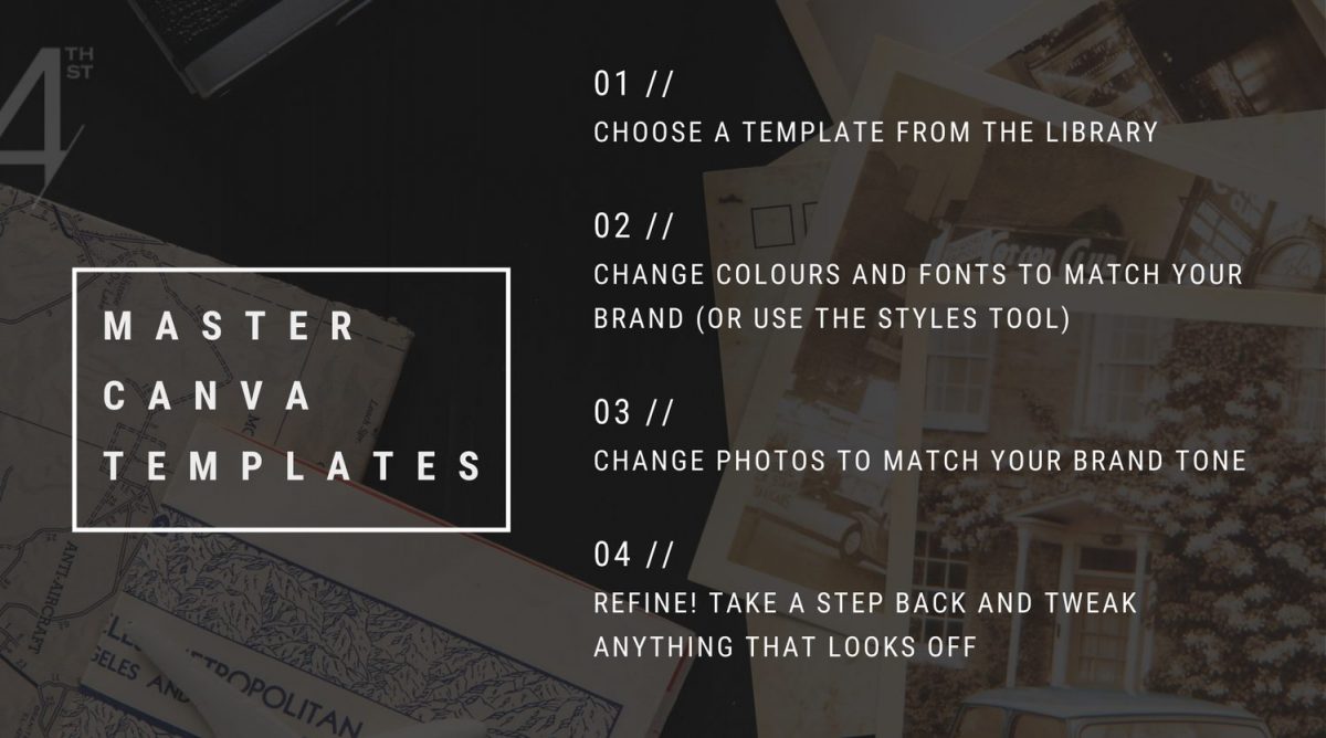
ONE | CHOOSE YOUR TEMPLATE
Any template. Really. No need to think and think – just choose one that you love, that gives you the tickles in your chest. (Or if you’re not as turned on by design as I am, then just pick one you think is swell! Awww.) We often overlook templates because the photography might make it look off-brand, so I urge you to take off those photo-focused frames and allow yourself to choose one that, at first glance, might not look totally on-brand for you.
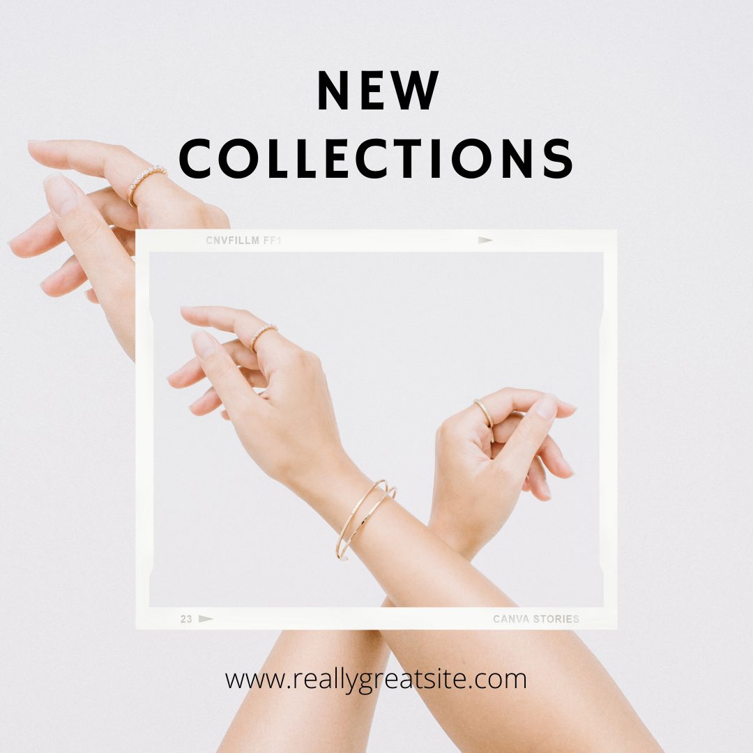
TWO | CHANGE THE FONT
Did you choose a modern, minimal template but your brand is classic luxe? Change the fonts to your brand fonts! Or if you haven’t quite landed on fonts you love, change the fonts to match the tone you’re going for. In this case, we wanted a moody vintage look so we swapped out a super modern font for one that was a bit more classic in nature.
Pro tip: Serif fonts (the ones with the little feet) are perfect for conveying a classic/vintage/timeless look.
THREE | CHANGE THE PHOTOS
Just swapping out the template photo for one of your brand photos or a stock photo that matches your brand style will completely change the look and feel of your template, completely flipping it on its head.
Pro tip: Imagery is powerful, so make sure you’re choosing photos that share the same colours, tones, or style throughout your marketing materials.
FOUR | COLOURS
In this example, we just added a dark background to create the moody vintage vibe and called it a day. Easy peasy. If your branding lends itself to more colour, then you’ll want to bring that into the template in the form of fonts, elements, or shapes.
FIVE | REFINE
Take a step back and make sure everything “works.” Is there too much of one colour? Is the font size right? Do you need to adjust the spacing on the text now that you changed the font? It’s common to think that it’ll still look beautiful if you swap out colours and fonts ‘cuz, well, it’s a template! But when you change even just one element – like the font – you’ll need to adjust some aspects of the design to make it look beautiful again. This is all personal preference and common sense. If your font is too small to read, you’ll want to make it larger. If you’ve changed the colour and now it looks a tad too colourful (yes, that’s possible, I promise!), choose another way to add your brand colour to the template – maybe by changing just one word’s colour or the colour of one shape.
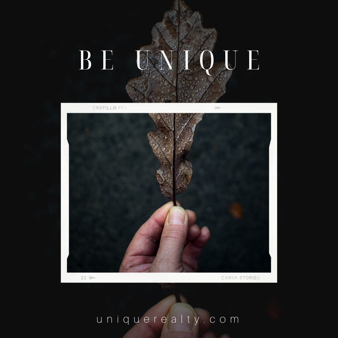
There you have it – in less than 2 minutes, you have a fresh as heck template ready to use!

