Let me ask you a question: How’s your IG looking these days? Are you super stoked with the look of your grid or do you dread catching even a tiny glimpse of your feed? (You mean that’s what my potential followers see?! Yikes.) If your feed needs a little SOS, then you’re in luck, my friend, because I’m about to share my 5 favourite tools that kick my Instagram posts up like 10 notches AND streamline my time on the platform – ‘cause this lady has things to do and spending hours on Instagram everyday isn’t an option.
Don’t get me wrong, I love the ‘gram! I love catching up with people (aka cyberstalking their accounts, it’s not creepy, it’s called research k?), posting helpful content, and finding new ways to show off my design skills. But it takes a lot of work to create a cohesive look that paints a clear picture of my brand. So, if you’re anything like me and like to keep things snappy and streamlined, then these tools might just be the answer you’ve been looking for!
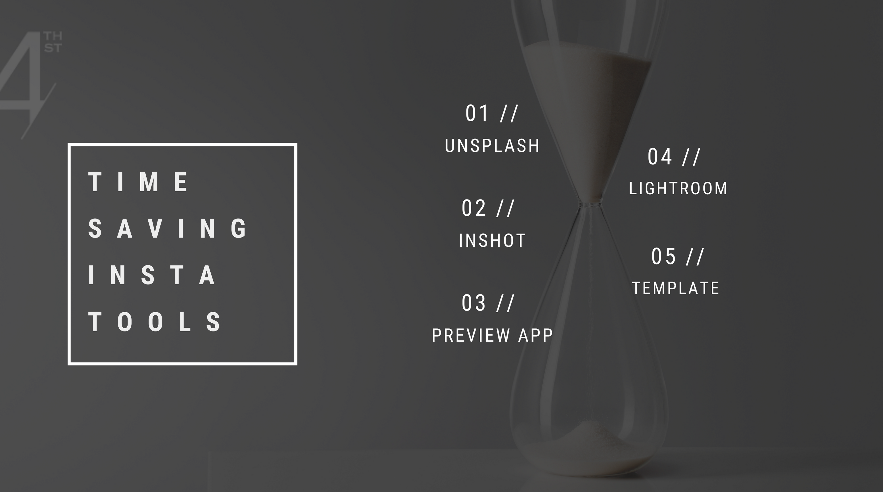
ONE | UNSPLASH
Unsplash is by far my favourite place to get super-stylized, royalty-free images. Imagine, if you will, a never-ending stream of drool-worthy pics for your real estate marketing that aren’t the stereotypical couple standing in front of a house holding the keys to their future. *eye roll* What I absolutely love about Unsplash is their wide variety of photo styles. Whether you’re Moody Vintage, Soft + Elegant, or Modern + Minimal, this place will NOT disappoint. (And if you have no clue what photos would look at home on your feed head over HERE to take a 2-minute quiz that will shed some much-needed light on your Insta brand style).
TWO | INSHOT
This handy and super user-friendly video editor is where I do ALL of my editing for the ‘gram. Sure, you can spend hours shooting and cutting your Reels right in the platform, but I’ve done the math (I can show you my scratchpad…) and editing outside of Instagram saves me hours every week. Here’s the thing: Inshot allows me to take the footage I recorded on Instagram and have full control of my editing, including transition effects, music placement, and aspect ratio (which means you can optimize for different platforms…I’m looking at you, YouTube!) As great as Instagram is, sometimes it’s just easier (and faster) to do things off-platform, and this versatile little video editor is my #pick to do just that!
THREE | PREVIEW APP
Preview is a free app that allows you to check out (aka preview) how your posts will fit into the overall look of your grid BEFORE committing to posting on Instagram. Just import your posts, move them around until you like how they look together and voila! You’ve got a grid that looks effortlessly chic and on-brand. This tool is something I use almost everyday because, unless you have some Mensa-level foresight, you run the risk of posting something that just looks, well, off… Don’t stress, boo, we’ve all been there! The 20 seconds it will take you to import and preview your posts in the app is totally worth it because you’ll have a grid you can be proud of, one that better represents your brand, and one that resonates with your ideal audience (aka future clients!).
FOUR | LIGHTROOM
Lightroom is an app that allows you to edit your photos and make them look as professional as possible before posting them to the ‘gram (Why, yes, I did hire a professional photographer for this photoshoot! wink). I am a huge Lightroom fan, and I have yet to find anything else that even remotely comes close to this gem of a tool. Now, you might be wondering, “Why can’t I just use the filters on Instagram?” You definitely can, but those filters pale in comparison to the control you have in Lightroom. If you’re into creating a beautifully curated feed with a high-end magazine look that shows off your marketing savvy to potential clients, then Lightroom is going to become your best friend. One of my favourite tools in Lightroom is presets. Presets are a group of saved adjustments you can apply over and over again to any photo, which means you create one preset that you LOVE and all you have to do is press a button every time you have a new photo to post on IG. Total time saver!
FIVE | TEMPLATES
Wanna know my #1 secret for streamlining my Instagram posting process? Templates. Templates allow me to create a consistent look on social media without reinventing the wheel every time. They are such a time saver, help your audience clearly recognize your content, and help you connect with them over time. So if you know your brand style and you’re comfortable creating your own visuals in Canva, then you can create a few templates for IG, use the duplicate tool, rearrange a few things in the design, and presto! You’ve got new templates with the same look and feel. If you don’t feel comfortable designing your own or are missing the design gene completely, then head over to the Template Shop where you can find templates for every brand style.
Did I miss anything? Let me know your favourite tools for streamlining your Instagram process in the comments!
