Have you ever wondered what professional-looking, pulled-together Instagram feeds have in common? Some sort of magical je ne sais quoi? It’s simpler than you think! The creators of these feeds understand that each post contributes to the whole (i.e., the overall look and feel of their grid). But how can you make sure that different types of photos and posts share the same vibe? Easy: By using a (free) photo-editing tool called Lightroom! (Did we mention that it’s free?! Who loves ya, baby?!) Follow along as I show you how to edit one photo to fit the feeds of two very different brand styles and create your own presets. Be forewarned – you’ll never look at your Instagram feed the same way again!
Start by downloading the Lightroom app onto your smartphone. Then, upload any photo from your camera roll into the app!
OPTION ONE | MODERN MINIMAL
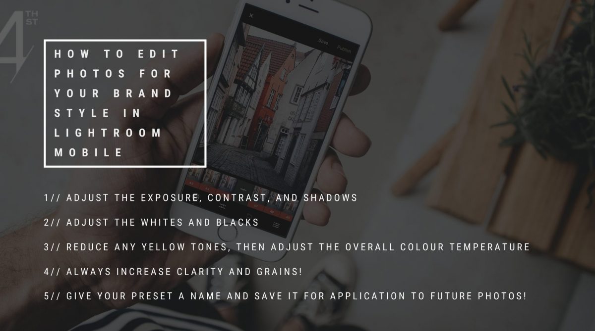
In the bottom bar, select “Light” and 1) increase the exposure (to make the photo lighter), 2) increase the contrast (this makes everything in the photo look better than in real life!), 3) increase (in this case, you’ll slide left!) the shadows (to make the photo lighter), and 4) increase the whites and decrease the blacks.
Use your finger to slide the bottom bar to find even more options. Select the colour tab, hit “Mix,” and reduce the yellow tones. Shhh…this is my secret weapon! Reducing the saturation of the yellow tones instantly makes a photo look more professional because it eliminates the effects of warm lighting. Hit “Done.”
Next, adjust the temperature so it’s a bit cooler (this suits a modern minimal vibe). Then, head back to your bottom bar and select “Effects.” Increase the clarity and add a bit of grain. And that’s it! Click the “Share” button in the top right corner to export your beautiful photo or save the new version to your camera roll.
Pro Tip: When lightening an image, be careful not to “blow it out.”
OPTION TWO | MOODY VINTAGE
Head back to your ORIGINAL image.
In the bottom bar, select “Light” and 1) reduce the exposure (to make the photo moodier), 2) increase the contrast (you’re almost always going to want to do this regardless of brand style!), 3) decrease (in this case, you’ll slide right!) the shadows (to make the photo darker), and 4) increase the blacks.
Select the colour tab, hit “Mix,” and reduce the yellow tones again.
Head back to the bottom bar and select “Effects.” Increase the clarity and add a bit of texture and grain. Add a slight vignette to add depth and draw the viewer’s eye to the center of the image. Once you’re happy with your final image, click the “Share” button in the top right corner to export or save the new version to your camera roll.
CREATING CUSTOM PRESETS
A preset is simply a group of adjustments (aka custom filter) that you save so you can apply them to a future photo with one simple click! Running all your photos through the same preset prior to posting will cultivate an aesthetic and make your feed look cohesive.
To create a preset from your Modern Minimal or Moody Vintage adjustments, click on the three dots in the top right corner and select “Create Preset.” Give your preset a name and then save it. Now, the next time you bring an image into Lightroom, you can simply hit the “Preset” button in the bottom bar to automatically apply your adjustments. You MAY still need to make further adjustments, but more than half of the work will be done for you. And by taking just a few minutes to edit your photos before posting them, they’ll blend seamlessly into your feed every dang time!
For more tips like these, make sure to join our FREE Facebook group The Design Den!

