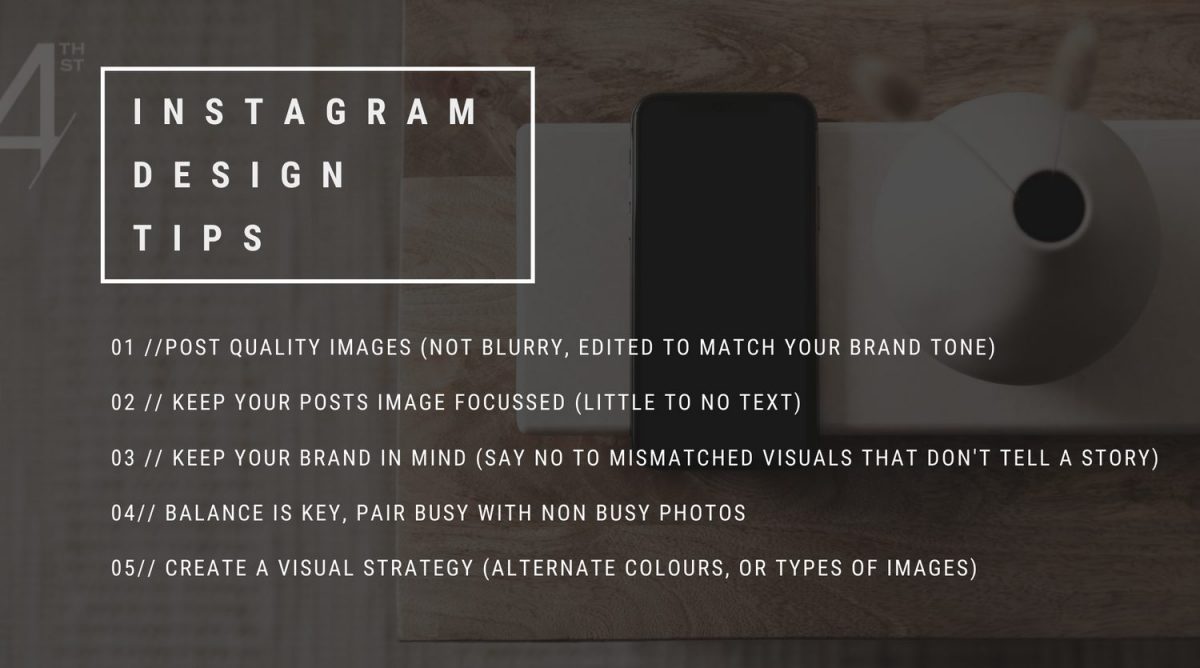
Got something juicy for you this week, my friend: the 5 most common design mistakes Realtors are making on Instagram. And because I love you: how you can fix them!
1 | USING POOR QUALITY IMAGES
These days, it’s almost impossible to have blurry images (hello, smartphone!). So as far as we’re concerned, there’s no excuse for out-of-focus, what-even-is-that photos. What we’re really talking about when we say “quality image” is editing your photos intentionally so they have the same look and feel every. single. time. – whether you’re popping them onto your Insta feed or plopping ‘em into your marketing materials.
Before you post anything to your grid, run it through a photo editing app. There’s TONS of free, easy-to-use options that can be downloaded straight to your smartphone. We like to use Lightroom (the free version is all you need!) because it lets us save our favourite presets so we can edit a photo with literally the click of a button! Taking the (minimal – promise!) time to edit your photos with intention is SO important – your cohesive, consistent feed (and your non-confused customers) will thank you!
Pro tip: Download presets!

2 | TOO MUCH TEXT!
Lemme ask you this: Why are you opening up Instagram? To be entertained, educated, and inspired, not to be sold to, amirite?
Something that looks like an idea just ain’t gonna stop the scroll! (I definitely scroll Instagram for the cute puppy photos, not the ads for flat tummy tea…). I’m talking specifically about TOO MUCH TEXT. Even Canva templates can be guilty of this so beware! Remember, your feed is for images and your captions are for words. Images evoke emotion and THAT’S that’s going to stop the scroll.
As Coco Chanel once oh-so-wisely said, “Before you leave the house, look in the mirror and take at least one thing off.” Translation? Less is more!
3 | INCONSISTENT BRANDING
We’re thinking of hiring Nick Stokes to help us figure out why branding seems to go right out the window when it comes to Instagram design. Instagram is likely your potential customer’s first introduction to you. You want to wow them with your marketing prowess right off the bat. If you can’t market yourself on Instagram, how are you going to successfully market their house?? (Seriously!)
ALWAYS be mindful of your branding elements. That means choosing brand colours and sticking to them, choosing brand fonts and sticking to them, choosing an overall tone and sticking to it – you get the idea! (If you need some guidance here, just head over to our Insta Style Quiz). Just promise us that you’ll approach your feed with an idea of what the bigger picture is, OK?
4 | NO BALANCE
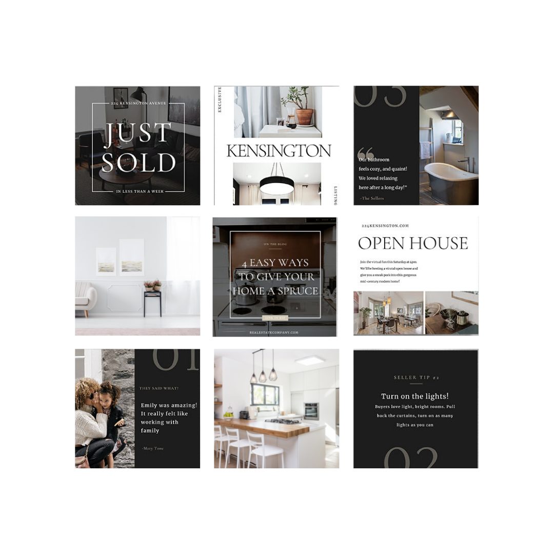
Your Instagram feed is like a scrapbook and your portfolio all at once. We’re aiming to impress potential customers with an overarching story, and it’s easier to digest that story if it’s balanced. A balanced aesthetic in your feed can mean a lot of different things, which is exactly where this gets fun! For example, you can achieve balance by making sure that you post a super clean and open photo after you post a busier looking one. Or maybe you post a quote card or testimonial between each listing photo. Alternate text posts with non-text posts. Whatever your strategy, just make sure you have one!

5 | NOT HAVING A VISUAL STRATEGY
Speaking of which… You’ll get a much, much, MUCH better response to your feed (likes, comments, follows, oh my!) if you have a visual strategy. Visual strategies are created with colour. For example, you could alternate your brand colours with each post or simply alternate lighter posts and darker posts.
Take the time to create a plan, then stay consistent with it. You want to create a brand that people recognize, that they’re familiar with, and that they want to follow!


